Create a responsive card grid with TailwindCSS and Angular
In a previous article, we built up a nice card view layout with TailwindCSS and Angular. In this article, we'll continue with that and convert it into a responsive card grid with TailwindCSS - without writing a single line of CSS!
Video tutorial
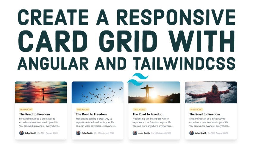
Our final result will be a responsive card grid like the following.
Notice how the grid columns reduce in number as the screen size reduces and vice versa!
Looks nice? Let's get started!
Setting up the project
We're going to continue with our previous project. So it is already setup with TailwindCSS added and the blog card layout built in the app.component.html file.
Adding some structure
We'll start by creating a Typescript interface for our blog post card. This will help us visualize our data items and provide a structure to our card. We can also avoid common bugs when we use types as our IDE will pinpoint those errors!
So let's create a blog-post-card.model.ts file and create an interface in it with the same name.
export interface BlogPostCard {
  mainImageUrl: string;
  category: string;
  title: string;
  description: string;
  postDate: string;
  authorImageUrl: string;
  authorName: string;
}
For simplicity, we've kept everything as a string for now. Though in a more real-world case, a Date type might be more suitable for the postDate.
Create a card component with input
Next, we'll create a card component with the following command.
ng generate component card
And we'll shift our card layout code here.
One small change we'll make here is to remove the explicit width that we'd set, because in a grid we want the width to be set automatically by the grid itself.
<div class="rounded-xl shadow-xl">
  // No width here!
  <img
    class="rounded-t-xl w-full h-36 object-cover"
    [src]="data.mainImageUrl"
  />
  ...
</div>
We'll now add an input of data to our card with the type that we've already defined i.e. BlogPostCard.
export class CardComponent implements OnInit {
  @Input()
  data!: BlogPostCard;

  constructor() {}
  ngOnInit(): void {}
}
Next we'll add references to the input data in our template, instead of the hardcoded data. The data now will be sent to the card from our main component.
<div class="rounded-xl shadow-xl">
  <img
    class="rounded-t-xl  w-full h-36 object-cover"
    [src]="data.mainImageUrl"
  />
  <div class="flex flex-col p-7">
    <div class="flex flex-row">
      <div
        class=" text-xs uppercase bg-yellow-100 p-1 px-2 text-yellow-700 rounded-2xl"
      >
        {{data.category}}
      </div>
    </div>
    <h2 class="text-xl font-bold truncate mt-1">{{data.title}}</h2>
    <p class="text-base text-gray-600 mt-1">{{data.description}}</p>
    <div class="flex flex-row mt-5 items-center justify-start">
      <img class="rounded-2xl mr-2" [src]="data.authorImageUrl" />
      <p class="font-bold text-sm mr-2">{{data.authorName}}</p>
      <p class="text-gray-400 text-sm">On {{data.postDate}}</p>
    </div>
  </div>
</div>
Great! So we have our card component now set up.
The data items for the grid
Now let's define the data items for our card grid!
We'll declare a posts array in our app.component.ts, with the data that we already have. I've also added some more data with some similarities and different images so we can have a more realistic grid.
posts: BlogPostCard[] = [
    {
      mainImageUrl: 'https://source.unsplash.com/odxB5oIG_iA/400x250',
      category: 'freelancing',
      title: 'The Road to Freedom',
      description:
        'Freelancing can be a great way to experience true freedom in your life. You can work anywhere, everywhere...',
      authorImageUrl: 'https://source.unsplash.com/7YVZYZeITc8/30x30',
      authorName: 'John Smith',
      postDate: '10th August 2020',
    },
    {
      mainImageUrl: 'https://source.unsplash.com/e-S-Pe2EmrE/400x250',
      category: 'freelancing',
      title: 'The Road to Freedom',
      description:
        'Freelancing can be a great way to experience true freedom in your life. You can work anywhere, everywhere...',
      authorImageUrl: 'https://source.unsplash.com/7YVZYZeITc8/30x30',
      authorName: 'John Smith',
      postDate: '10th August 2020',
    },
    {
      mainImageUrl: 'https://source.unsplash.com/EAvS-4KnGrk/400x250',
      category: 'freelancing',
      title: 'The Road to Freedom',
      description:
        'Freelancing can be a great way to experience true freedom in your life. You can work anywhere, everywhere...',
      authorImageUrl: 'https://source.unsplash.com/7YVZYZeITc8/30x30',
      authorName: 'John Smith',
      postDate: '10th August 2020',
    },
    {
      mainImageUrl: 'https://source.unsplash.com/RP6Ba_6U154/400x250',
      category: 'freelancing',
      title: 'The Road to Freedom',
      description:
        'Freelancing can be a great way to experience true freedom in your life. You can work anywhere, everywhere...',
      authorImageUrl: 'https://source.unsplash.com/7YVZYZeITc8/30x30',
      authorName: 'John Smith',
      postDate: '10th August 2020',
    },
    {
      mainImageUrl: 'https://source.unsplash.com/I2YSmEUAgDY/400x250',
      category: 'freelancing',
      title: 'The Road to Freedom',
      description:
        'Freelancing can be a great way to experience true freedom in your life. You can work anywhere, everywhere...',
      authorImageUrl: 'https://source.unsplash.com/7YVZYZeITc8/30x30',
      authorName: 'John Smith',
      postDate: '10th August 2020',
    },
    {
      mainImageUrl: 'https://source.unsplash.com/hpTH5b6mo2s/400x250',
      category: 'freelancing',
      title: 'The Road to Freedom',
      description:
        'Freelancing can be a great way to experience true freedom in your life. You can work anywhere, everywhere...',
      authorImageUrl: 'https://source.unsplash.com/7YVZYZeITc8/30x30',
      authorName: 'John Smith',
      postDate: '10th August 2020',
    },
    {
      mainImageUrl: 'https://source.unsplash.com/2TQwrtZnl08/400x250',
      category: 'freelancing',
      title: 'The Road to Freedom',
      description:
        'Freelancing can be a great way to experience true freedom in your life. You can work anywhere, everywhere...',
      authorImageUrl: 'https://source.unsplash.com/7YVZYZeITc8/30x30',
      authorName: 'John Smith',
      postDate: '10th August 2020',
    },
    {
      mainImageUrl: 'https://source.unsplash.com/cGwfkwHmt98/400x250',
      category: 'freelancing',
      title: 'The Road to Freedom',
      description:
        'Freelancing can be a great way to experience true freedom in your life. You can work anywhere, everywhere...',
      authorImageUrl: 'https://source.unsplash.com/7YVZYZeITc8/30x30',
      authorName: 'John Smith',
      postDate: '10th August 2020',
    },
  ];
Of course, in a real-world case, you'll probably be getting this data from an API call.
With all of our data now setup, let's get on to actually building the grid.
Building the responsive card grid
So we'll first create a card component for each of the posts with the *ngFor directive.
<app-card *ngFor="let post of posts" [data]="post"></app-card>
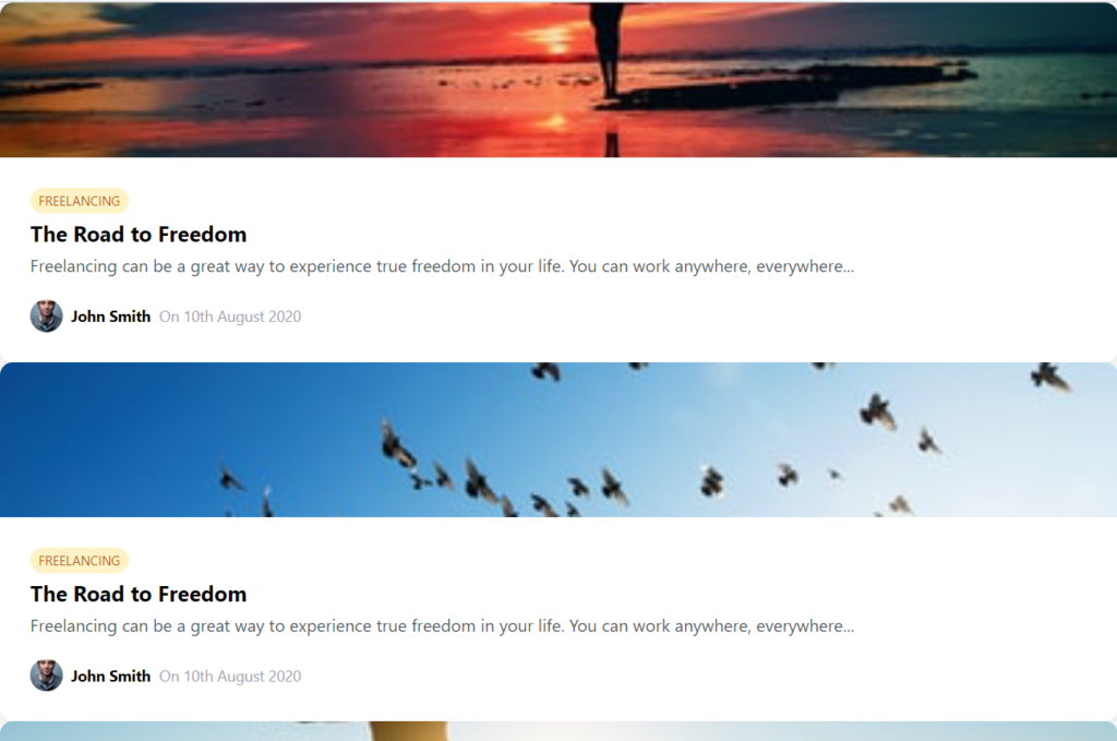
Pretty simple. So the cards do show up, but only in a list form!
Let's create a containing div and add a grid class to it and then a grid columns specifier.
<div class="grid grid-cols-3">
  <app-card *ngFor="let post of posts" [data]="post"></app-card>
</div>
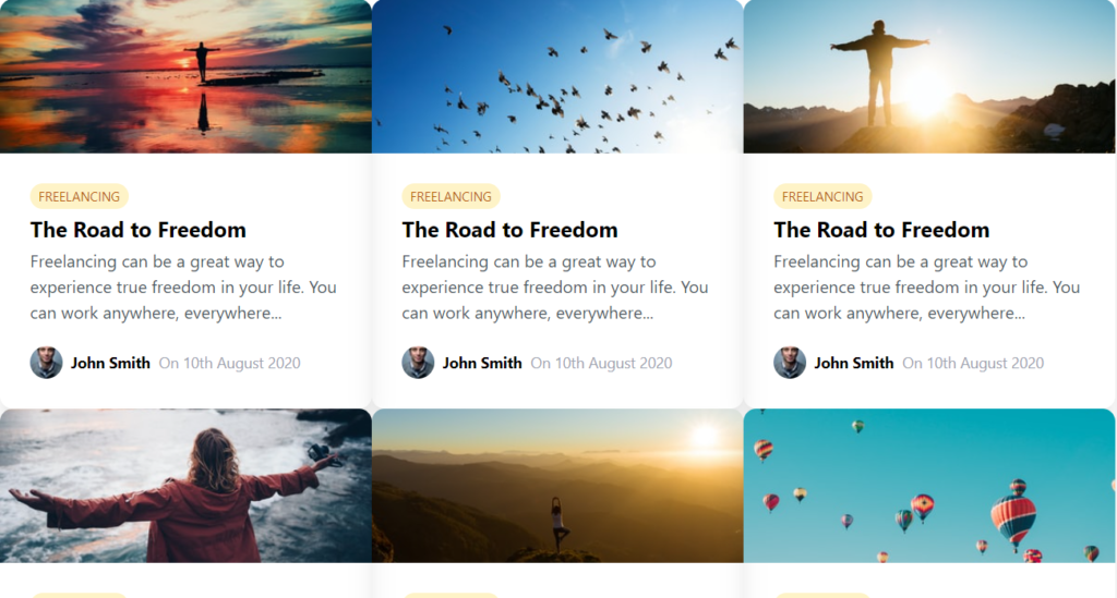
This looks ok, except there's no spacing! So we need a padding and a gap in our grid. Let's add the same amount of padding and gap to our grid.
<div class="grid grid-cols-3 p-8 gap-8">..</div>
Great, so now we have ourselves a grid!
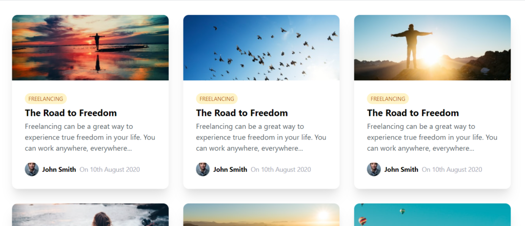
Now what we want to do to create a responsive grid, is to specify the columns for each of the breakpoints i.e. sm, md, lg and xl. In TailwindCSS, you can do this by appending a colon to the breakpoint like below.
<div
  class="grid grid-cols-3 p-8 gap-8 sm:grid-cols-1 md:grid-cols-2 lg:grid-cols-3 xl:grid-cols-4"
>
  ....
</div>
Great! So now if you test it out by reducing the screen width and then increasing it, you'll notice our card grid adjusts itself to the space available.
A bit of hover interaction to liven it up!
Lastly, let's also add a small tweak that will make our card grid become more interactive. We'll add a small animation on hover of each card to signal to the user that this can be clicked.
<app-card
  class="transition-transform transform hover:scale-105 cursor-pointer duration-300 ease-in-out"
  *ngFor="let post of posts"
  [data]="post"
>
</app-card>
In TailwindCSS, you first specify that you need a transition and then a transform. Then, you just need to specify the transformation with a colon after the state of the element (hover, in our case). We're using a scale transform to emphasize the hovered over card!
Let's see how it looks like now!
A nice, smooth hover animation to spice things up - Cool!
Conclusion
As you can see, it can be really simple and quick to build complex great looking layouts with TailwindCSS like a responsive card grid. But this is not all you can do with TailwindCSS.
With just a bit of familiarity with the classes we have available, the sky is the limit and you're only limited with your creativity!
I hope you've enjoyed this as much as I did while making it.
The complete code for this tutorial can be found here.
Thanks for reading! Bye 😊


