Multi-Slot Content Projection in Angular
In a previous article, I introduced you to the concept of Content Projection in Angular and how it can be used to design flexible components. In this article, I'll continue with that and show you how to add multi-slot content projection in Angular.
Video tutorial
Previously we had created a profile page which had different kinds of profile data like below.
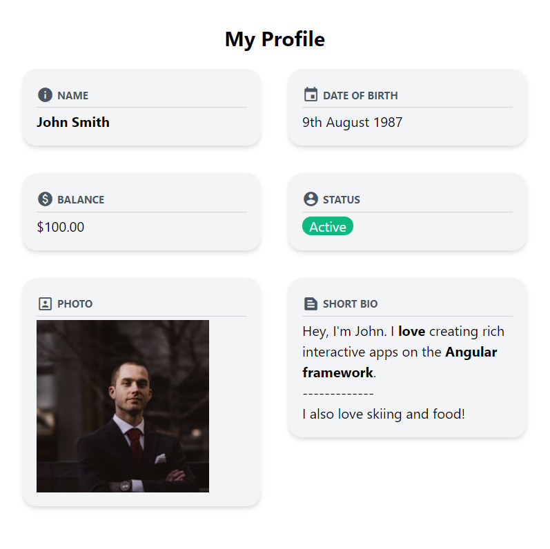
Now imagine if we have to allow the user to edit any of our profile information. How do we do this?
The need for multi slot content projection
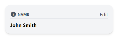
One way could be to add a button right besides the caption to edit or update the data. We can make this "actions" button part of the component itself, but we need to make it more flexible.
So e.g. we'd like the caption to be different for the different data.
For balance, we'd like to show "Update balance". Also, on some data such as the profile photo, we'd like multiple action buttons, instead of a single one.
So to allow all of that we can use content projection and send in the buttons from outside the component just like we did with the content. There's just one issue though - our ng-content tag is already there and only allows us to project one content.
Fortunately, in Angular we can also specify multiple slots for content projection.
Selection options
So for the ng-content, we can specify a "select" with different selectors. We can select by
- Class name e.g. title. This will select all content with class title.
- HTML Tag e.g. h1. This will select all h1 content.
- Custom attributes e.g. actions. This will only select those elements in the content marked with this attribute.
Let's go ahead and use the last method - and call our custom attribute actions.
<div class="p-4 bg-gray-100 rounded-2xl shadow-md">
  <div
    class="flex flex-row items-center text-gray-600 border-b border-gray-300 mb-1"
  >
    <span class="material-icons mr-1 text-xl">{{icon}}</span>
    <span class="uppercase text-xs font-bold">{{caption}}</span>
    <div class="flex-grow"></div>
    <ng-content select="[actions]"></ng-content>
  </div>
  <div class="pt-1">
    <ng-content></ng-content>
  </div>
</div>
We've added another div in our caption row so that the content is stretched to the end. Then we add the ng-content with the actions custom selector.
Once we've done that, we can then just add the button in app.component.html and specify the attribute there.
...
<app-data-view icon="info" caption="Name">
  <button actions>Edit</button>
  <span class="font-bold">John Smith</span>
</app-data-view>
...
And we have the button projected at the place we want!
This looks a bit shabby though, so let's quickly create an action button component to standardize the appearance.
Creating the action button component
To create the action button component, let's use the following command
ng generate component action-button
Then, we'll add the two inputs that we need - icon and label.
export class ActionButtonComponent implements OnInit {
  @Input() icon = "";
  @Input() label = "";

  constructor() {}

  ngOnInit(): void {}
}
Lastly, let's add our template to the component.
<button
  class="py-1 px-3 flex flex-row justify-center items-center rounded-full bg-gray-300 text-gray-800 mb-1 hover:bg-gray-400"
>
  <span class="material-icons text-sm mr-1">{{icon}}</span>
  <span class="text-sm">{{label}}</span>
</button>
We're using TailwindCSS classes to add some background colors, border radius and a hover style as well for the button. Then we're just styling the icon and labels to appear suitable.
Putting it all together!
Now that we've our component ready, we'll just use the component in our profile data items and see how it looks!
...
<app-data-view icon="info" caption="Name">
  <app-action-button actions icon="edit" label="Edit"></app-action-button>
  <span class="font-bold">John Smith</span>
</app-data-view>
...
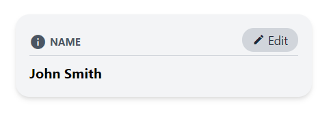
Looks great! Now let's add it to the rest of our data items as well.
For the balance, we'd like the button to be called Re charge because that makes more sense.
<app-data-view icon="paid" caption="Balance">
  <app-action-button
    actions
    icon="payment"
    label="Recharge"
  ></app-action-button>
  {{100 | currency}}
</app-data-view>
And for the photo, we'd like two buttons - one for uploading from your computer and the other from your Google Drive. So we'll create a flex row and mark the whole row as "actions".
<app-data-view icon="portrait" caption="Photo">
  <div actions class="flex flex-row">
    <app-action-button
      class="mr-1"
      actions
      icon="upload"
      label="Upload"
    ></app-action-button>
    <app-action-button
      actions
      icon="insert_drive_file"
      label="G Drive"
    ></app-action-button>
  </div>
  <img src="https://source.unsplash.com/WMD64tMfc4k/200x200" />
</app-data-view>
Let's test this out now!
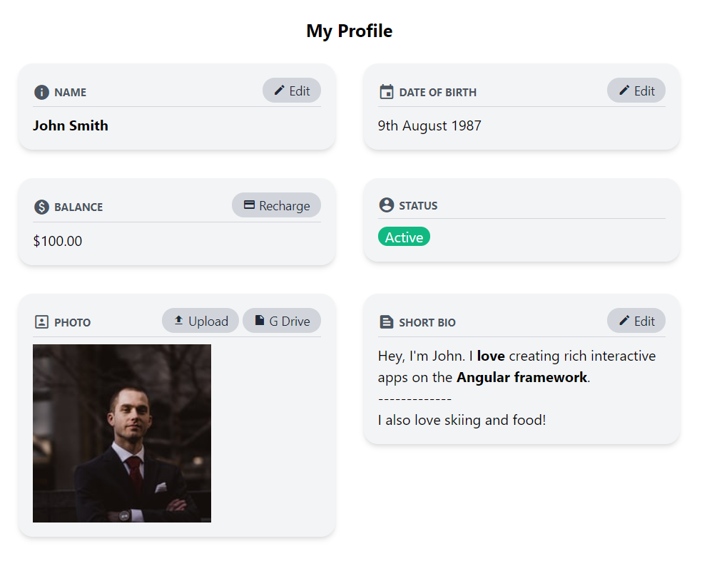
Nice! So as you can see, we can have different buttons projected inside the component to suit our flexible needs in this case. All of this without needing to add any more inputs to our original data view component (which would overcomplicate it!).
The Angular Material Card
This technique of multi-slot content projection is also used in Angular Material Components e.g. in their Material Card Component. If you've used that you'll notice it allows selectors like mat-card-title to specify the title and subtitle of the card. If you look at its source code - you'll notice the same "select" being used to utilize multi slot projection.
<ng-content select="[mat-card-avatar], [matCardAvatar]"></ng-content>
<div class="mat-card-header-text">
  <ng-content
    select="mat-card-title, mat-card-subtitle,
      [mat-card-title], [mat-card-subtitle],
      [matCardTitle], [matCardSubtitle]"
  ></ng-content>
</div>
<ng-content></ng-content>
This allows us to use the Material Card's layout but add our own custom elements as well if needed!
Conclusion
Content projection is a great little technique that you can use to create reusable but flexible components. We've learnt in this article how to create multiple slots for content projection to make components similar to the Angular official material design library.
The complete code for this tutorial can be found here.
I hope you liked this article. If you did, feel free to follow me on twitter for updates about future articles!
Thanks for reading - Bye 😊


