Better Angular Components with Content Projection
In this short article, I'll introduce you to the concept of content projection in Angular and how we can use it to create reusable but more flexible components in our apps.
Video tutorial
If you're more of a reader, continue below :)
What are components
Components are building blocks of any Angular app and whenever we see some amount of repetition in our code, it's best practice to convert the common bits into a reusable component. This makes future changes much easier because we only need to change things in one place.
The problem with components
Let's assume we need to create a UI for showing user profile information such as below.
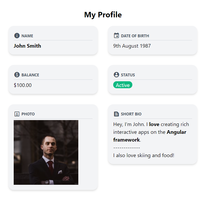
Now you can see here that the overall structure of each of the data is quite similar - there is an icon, a caption, a border and the background.
So it's a good candidate for a reusable component in Angular.
But the content in each of them is different - there is a colored chip, then a photo and some HTML text even. We can try passing in different kinds of inputs to this component to render the different types of views but that would not only be time consuming, but also difficult to scale to new types of data to be displayed.
In time our reusable component will have lots of different types and unnecessary bloated implementation - hard to change and test!
There has to be a better way! Enter Content Projection in Angular.
Content Projection
Content Projection allows us to specify any content from outside of our component and "projects" it inside wherever we specify. We specify the location for the projection with the ng-content placeholder element inside of our component.
Let's work through some code to see how this works!
Creating the reusable component
We have setup a basic Angular app with TailwindCSS added to it. In case you're wondering how to do that, you might find an earlier post of mine useful!
Next, we're going to create a new component with the following command.
ng generate component data-view
From the layout above, we can see we need an icon and caption input. Both of these are strings, so we can easily pass them in with the Input decorator.
export class DataViewComponent implements OnInit {
  @Input() icon = "";
  @Input() caption = "";
}
Next, we'll quickly add the layout for the component using TailwindCSS classes.
<div class="p-4 bg-gray-100 rounded-2xl shadow-md">
  <div
    class="flex flex-row items-center text-gray-600 border-b border-gray-300 mb-1"
  >
    <span class="material-icons mr-1 text-xl">{{icon}}</span>
    <span class="uppercase text-xs font-bold">{{caption}}</span>
  </div>
</div>
In short, what we've done here is add a container with some background and shadow. Then we've added a flex row inside of it with the icon and caption side by side. For the icon, we're using the material icons - with it's styles included in our index.html.
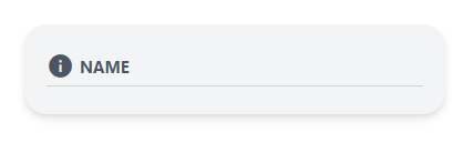
To test this, let's add it to our app component with an enclosing 2 column grid class and the inputs we need.
<div class="p-7">
  <h1 class="text-2xl text-center font-bold mb-5">My Profile</h1>
  <div class="grid grid-cols-2 gap-8">
    <app-data-view icon="info" caption="Name"> </app-data-view>
  </div>
</div>
This is how it looks now. Perfect for what we want.
Adding the ng-content placeholder
Now for the interesting part! All we have to do to allow our component to show content from outside is to specify ng-content where we want it to show.
<div class="p-4 bg-gray-100 rounded-2xl shadow-md">
  <div
    class="flex flex-row items-center text-gray-600 border-b border-gray-300 mb-1"
  >
    <span class="material-icons mr-1 text-xl">{{icon}}</span>
    <span class="uppercase text-xs font-bold">{{caption}}</span>
  </div>
  <ng-content></ng-content>
</div>
So now, whatever we enclose within the component will be projected inside of the component at the place where we have ng-content.
Let's test this out by giving our user a name and making it bold!
...
<app-data-view icon="info" caption="Name">
  <span class="font-bold">John Smith</span>
</app-data-view>
...
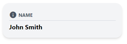
Great, content projection works. It's as simple as that!
Note, that now we can send in just about anything as a content to our component. Let's add more data items so we can truly see how it handles the different types!
<app-data-view icon="info" caption="Name">
  <span class="font-bold">John Smith</span>
</app-data-view>
<app-data-view icon="event" caption="Date of Birth">
  9th August 1987
</app-data-view>
<app-data-view icon="paid" caption="Balance">
  {{100 | currency}}
</app-data-view>
<app-data-view icon="account_circle" caption="Status">
  <span class="px-2 bg-green-500 rounded-xl text-white">Active</span>
</app-data-view>
<app-data-view icon="portrait" caption="Photo">
  <img src="https://source.unsplash.com/WMD64tMfc4k/200x200" />
</app-data-view>
<app-data-view icon="text_snippet" caption="Short bio">
  <div>
    Hey, I'm John. I <strong>love</strong> creating rich interactive apps on the
    <strong>Angular framework</strong>.
    <br />
    -------------
    <br />
    I also love skiing and food!
  </div>
</app-data-view>
How does it look?
Nice! We have ourselves a reusable component which is also flexible enough to accept complex layouts from outside 🔥 🔥
Conclusion
In a parting note, this is the simplest example of content projection. In more complex components such as the Angular Material Card multiple contents are being projected by using selectors.
I've covered selectors and how we can utilize them in my next article. Check it out here!
The complete code for this post can be accessed here.
Thanks for reading!
Bye :)


