
How to lazy load Angular Material Dialogs
In an earlier post, I showed you how to create reusable confirmation dialogs with angular material components. In this video, we'll cover how to lazy load your material dialogs using an advanced way with Angular v9+.
Video tutorial
What is Lazy Loading
First, why do we need lazy loading? Well, whenever you create a material dialog component, it is included in your main app bundle by default. This works great for small apps. But for medium to large apps, you might have several different dialogs for different sections of the app.
Why should we load all of them upfront, when the user might only need some of them?
Enter Lazy Loading.
Lazy Loading means the dialog components will be bundled separately and will be fetched when the dialog is opened.
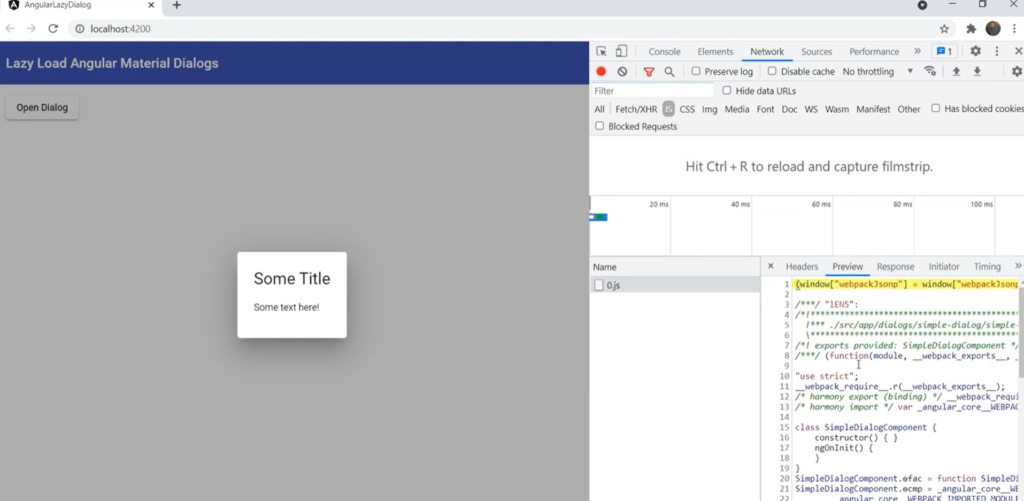
This ensures your main app will load fast for your users and the dialog is only loaded when needed. Here's a snapshot showing our lazy loaded dialog and its lazy loaded chunk from a sample app we'll be building now.
Just a disclaimer, this technique only works with Angular version 9 and above - with the Ivy compiler.
Let's get started and see how we can do this!
Setting up the project
First, we'll ensure we've the material library installed in our project. We can do this with the following command.
ng add @angular/material
Then, we'll include the required MatDialogModule and some other modules in our app.module.ts file.
import { MatDialogModule } from "@angular/material/dialog";
import { MatButtonModule } from "@angular/material/button";
import { MatToolbarModule } from "@angular/material/toolbar";
import { CommonModule } from "@angular/common";

@NgModule({
  declarations: [AppComponent],
  imports: [
    BrowserModule,
    BrowserAnimationsModule,
    MatDialogModule,
    MatButtonModule,
    MatToolbarModule,
    CommonModule,
  ],
  providers: [],
  bootstrap: [AppComponent],
})
export class AppModule {}
Creating the dialog component
Next, we'll create our dialog component which we want to lazy load with the name of simple-dialog. We'll add it to a dialogs folder.
ng generate component dialogs/simple-dialog
For now we'll just give a title and some text to our dialog.
<h1>Some Title</h1>
<p>Some text here!</p>
We'll also remove it from the declarations in the app module, because we don't want it to be included in our main bundle.
Creating a lazy dialog service
Next, let's create a service to lazy load our Angular Material dialogs. We'll call it lazy-dialog service.
ng generate service services/lazy-dialog
Let's create a function here called openDialog - which would take in the dialogName and return the MatDialogRef.
export class LazyDialogService {
  constructor(private dialog: MatDialog) {}

  async openDialog(dialogName: string): Promise<MatDialogRef<any>> {
    const chunk = await import(
      `../dialogs/${dialogName}/${dialogName}.component`
    );
    const dialogComponent = Object.values(chunk)[0] as ComponentType<unknown>;
    return this.dialog.open(dialogComponent);
  }
}
The first and the most important bit here is to use the webpack import function to get the dialog component chunk. This is an async function so we'll have to use await and also add async to our parent function.
The path inside of this will be our dialogs folder and then the dialog component itself.
Now, when webpack sees this import function, it'll create chunks of all of the components in the folder, expecting that any of them can be lazy loaded.
Once we fetch this chunk, we just need to get the first value of this object which will be our component and cast it as a ComponentType. Then, we'll just add the MatDialog to our constructor and use the open function to open this dialog.
Simple, right?
We just need one last bit of change to get this working as it should. We need to add the dialogs folder to the tsconfig.app.json in the include section. This ensures the dialog components are compiled properly, otherwise you'll get a warning.
{
  "extends": "./tsconfig.json",
  "compilerOptions": {
    "outDir": "./out-tsc/app",
    "types": []
  },
  "files": ["src/main.ts", "src/polyfills.ts"],
  "include": ["src/**/*.d.ts", "src/app/dialogs/*/*.component.ts"]
}
Let's test all this out by creating a button in app component, including our lazyDialog service in our component and calling the openDialog function with our dialog's name.
<button mat-raised-button (click)="lazyDialog.openDialog('simple-dialog')">
  Open Dialog
</button>
export class AppComponent {
  constructor(public lazyDialog: LazyDialogService) {}
}
Let's do ng serve and test!
We'll open up our developer tools to see exactly what happens when we open the dialog. When you click on Open Dialog, our dialog component chunk is loaded. And this contains the whole component that we created.
Great, this works well!
Creating complex material dialogs
What we've created till now is great for very simple dialogs, but for more practical use cases we'll need material components and other packages in our dialogs. To do that, we need to declare a module in our dialog component to bind everything up.
Let's go ahead and add an NgModule decorator in the same file as our component and specify our component in the declarations. Then we can add our libraries in the imports section.
@Component({
  selector: "app-simple-dialog",
  templateUrl: "./simple-dialog.component.html",
  styleUrls: ["./simple-dialog.component.css"],
})
export class SimpleDialogComponent implements OnInit {
  constructor() {}

  ngOnInit(): void {}
}

@NgModule({
  declarations: [SimpleDialogComponent],
  imports: [MatDialogModule, MatFormFieldModule, MatInputModule],
})
export class SimpleDialogModule {}
We've added MatFormField, MatInput, MatDialog so that we can create a simple form for us.
Last, we'll quickly add four fields and a title to test this out.
<h2 mat-dialog-title>My Form</h2>

<mat-form-field>
  <input matInput placeholder="Enter your first name" />
</mat-form-field>

<mat-form-field>
  <input matInput placeholder="Enter your last name" />
</mat-form-field>

<mat-form-field>
  <input matInput placeholder="Enter your location" />
</mat-form-field>

<mat-form-field>
  <input matInput placeholder="Enter your age" />
</mat-form-field>
Let's quickly test this with ng serve!
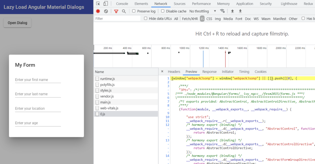
Great, the dialog chunk loads fine and shows up fine as well. When you look into the chunk though, you'll see it not only contains the component, but also the material library dependencies that it needs!
What magic is this
So how does this all work?
Well, it can get a bit too technical. But in Angular Ivy a component contains all of the data required (including any dependencies) in the component itself. So that is all you need to render it. Previously, it was the module which contained all of this data which made dynamic component fetching a bit more complicated.
For more detail, check out Netanel Basal's excellent blog post on dynamically loading components in Angular Ivy. Netanel's blog was actually the inspiration behind this post as well and has tons of other useful Angular related stuff to check out.
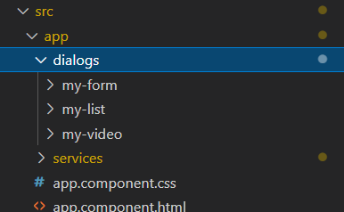
A more complete example
To show a more complete example, I've created two more dialogs, one with a youtube player and the other with a material list and icons. I've followed the same pattern as detailed above. The new dialog components were added to the dialogs folder. And with the rest of the project already setup, we don't need to do anything extra, except add two buttons to open these dialogs.
I won't be covering the code for the two new dialogs here for space reasons. Please refer to the github repo I've setup for this post right at the very end.
Let's just show a quick test video of how it looks like.
Great, so each has a separate chunk and loads when we open them up.
And the best thing is, our main app bundle size remains the same as it was before. This way we can theoretically add as many dialogs as we want - without affecting our app size one bit!
Conclusion
So there you have it. We covered an advanced way to lazy load Angular Material Dialogs which will help you avoid bloating your apps with a lot of code and only loading dialogs when necessary.
As the focus on web performance grows nowadays, this can be a great help to keep your app load times in check! Thankfully, Angular now allows us to do so with dynamic component loading.
The complete code for this tutorial can be seen at this github repo.
Thanks for following this till the end. Bye 😊


