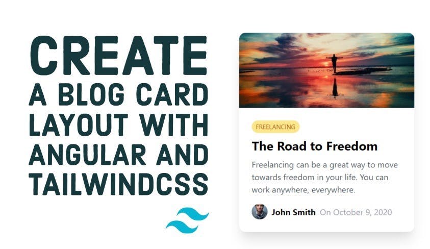
Create a blog post card layout with Angular and TailwindCSS
In this article, we'll create a blog post card layout using Angular and TailwindCSS and it's utility first pattern.
Video tutorial
If you're more into reading, continue below!
TailwindCSS has been getting a lot of attention nowadays because it saves us from writing custom CSS in our styles and instead relies on adding class names to our HTML.
This makes it very fast to create great looking layouts without writing a single line of CSS!
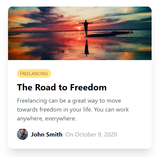
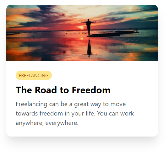
Our final result will be the following blog post card layout.
Looks good, right? Let's get started then!
Adding TailwindCSS to our Angular app
First, we'll create a new angular 11.2 project and add TailwindCSS to it.
If you're wondering how to do that, I've already covered it in a previous blog post. Click here to go through that!
Once that is done, let's start building the card layout with TailwindCSS!
The main card image section
The first part of the card is the image at the top. It covers the whole card without any padding and should also have a fixed height and width, so that it matches other cards in a grid view.
First, we'll stretch the container to the whole screen and then add a container for the card itself. We're giving the card a fixed width here relative to the screen for now. We've also added a nice rounded edge to the card and a bit of shadow for depth!
<div class="h-screen w-screen flex items-center justify-center">
  <div class="w-2/3 rounded-xl shadow-xl"></div>
</div>
Next, let's add the img element with it's styling!
<img
  class="w-full rounded-t-xl h-36 object-cover"
  src="https://source.unsplash.com/odxB5oIG_iA/400x250"
/>
So a couple of things to note here. We're stretching the image to extend to the width of the card while the height is fixed so we can have a uniform card height. We want it rounded as well, but only at the top!
Lastly, we're using object-cover to say that the image should cover the whole of the container. This is so we don't see issues with images of different sizes and aspect ratios (which is common when getting images from APIs).
As a result, we have the following!
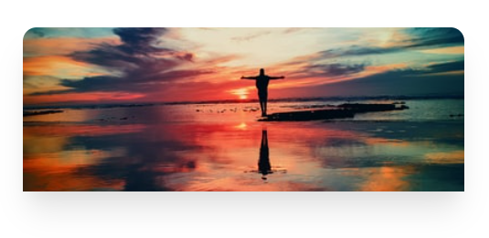
Great! Just what we want.
We'll go ahead and add a containing div below this and also add some padding before adding the sections below the image.
<div class="p-6"></div>
The category tag
For the category tag, we'll add a flexbox row and add the category inside of it. Here, we'll mostly be adding some styling to the tag to make it resemble a status chips component.
<div class="flex flex-row">
  <div
    class="uppercase text-xs text-yellow-700 bg-yellow-200 px-2 py-1 rounded-xl"
  >
    freelancing
  </div>
</div>
So basically some colors, background and padding. And we've topped it all with a rounded class to make the pill shape!
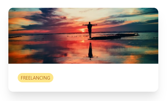
Great. The category tag looks nice!
Card title and description
So let's move on to the card title. Nothing much here, except for some font size and style changes. And a bit of margin to give some space!
<h2 class="text-2xl mt-2 font-bold">The Road to Freedom</h2>
For the card description, it's pretty much the same, except for smaller font sizes and a bit of a darker gray color, instead of black. This makes the title pop more and creates a distinction between the title and the description.
<p class="mt-2 text-gray-600">
  Freelancing can be a great way to move towards freedom in your life. You can
  work anywhere, everywhere.
</p>
We're almost there!
The author section
For the author section, we want the elements to be laid out in a row. So we'll use a flexbox container and add the individual elements inside of it.
<div class="flex flex-row mt-4 items-center">
  <img
    class="rounded-full mr-2"
    src="https://source.unsplash.com/7YVZYZeITc8/30x30"
  />
  <div class="font-bold mr-2">John Smith</div>
  <div class="text-gray-400">On October 9, 2020</div>
</div>
The image is small as it is (30 pixels) and we make the edges round so it gives a good look! We've added some margins to give spacing to each element. And for the date specifically, we've used a lighter gray color because it is supplementary information and not something we want to give primary focus to.
Great and that's just about it! Let's take a look :)
Nice and simple, but elegant in design. Best part is the speed at which we could come up with this, without writing a single CSS rule in our styles!
Conclusion
As you can see, TailwindCSS has made building great looking layouts fast and convenient. It may look a bit cluttered in your HTML code, but with the speed with which it allows us to work and the other benefits it brings in reusability of classes etc., I feel it is worth it to use for my apps!
Do you feel the same? Or still on the edge?
Try it yourself and let me know!
Continue to the next part in this series, where I'll convert this card into an Angular component and then a responsive card grid layout - all using TailwindCSS for styling!
Thanks for reading! Bye 😊


