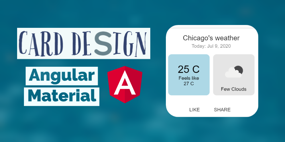
Design a Weather Card With Angular Material and CSS
Cards an essential UI element nowadays for almost any web application. Here is how to create a simple Angular Material card which shows the weather for today.
This article is a companion piece for my recent tutorial on RxJS in Angular: Creating a Weather App. It explains in a bit of detail how I designed and developed the weather card view. If you haven't already gone through that, do check it out!
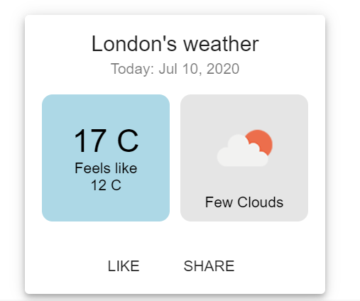
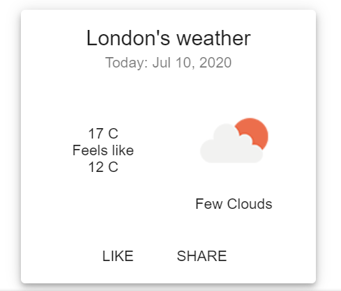
This is the Angular Material Card view we're going for.
Without further ado, let's start with the basic template code for the card. Instead of dynamic data, for this tutorial I'll just use hard-coded values to give an example.
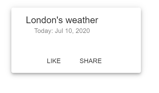
<mat-card class="mat-elevation-z5">
  <mat-card-header>
    <mat-card-title>London's weather</mat-card-title>
    <mat-card-subtitle>Today: July 10, 2020</mat-card-subtitle>
  </mat-card-header>
  <mat-card-content> </mat-card-content>
  <mat-card-actions>
    <button mat-button>LIKE</button>
    <button mat-button>SHARE</button>
  </mat-card-actions>
</mat-card>
So the first thing we did was to specify a basic Angular Material Card component. You can get the code from the official Angular Material documentation. There are three sections to it, the header, the content and the actions.
We add the title and the subtitle to the values as above. And also add a mat-elevation-z5 class. This is used to add the nice shadow effect for the card which gives it a bit of elevation as if it's floating in mid-air. Pretty standard, but still very nice!
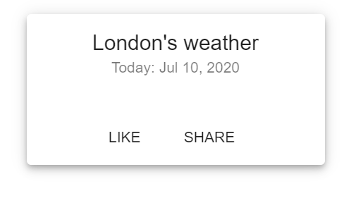
Centering the title on the Angular Material Card
One issue here is that by default the title and subtitle on the mat-card component are left aligned. If you inspect this further, you'll see this is due to the width of the header text element. We can fix this by using the ng-deep selector in our CSS file.
mat-card::ng-deep.mat-card-header-text {
  width: 100%;
}
::ng-deep is a useful combinator for when you want to affect any classes deep within an object's DOM hierarchy. Without this, we won't be able to change the .mat-card-header-text class as we want to for our purposes.
It should be used sparingly though, since it is basically violating the component style encapsulation as provided by Angular. On one or two places, it's fine. But if you find changing a lot of stuff with this, maybe it's best to come up with your own custom component.
The official Angular documentation says ::ng-deep will be deprecated soon. However, this doesn't seem to be the case as there is no convenient alternative for the time being and lots of projects are using it for the same purpose as we did here.
All better now!
The weather card content
Next, let's add our content. We need two boxes side by side with a little bit of gap. Let's add the container first and the two boxes in it.
<div class="flex-row>
      <div class="temp">
        <span>17 C</span>
        <span>Feels like </span>
        <span>12 C</span>
      </div>
      <div class="outlook">
        <img src="http://openweathermap.org/img/wn/02d@2x.png" />
        <span>Few Clouds</span>
      </div>
</div>
The class names give an indication of what's coming. We need to add CSS for converting this into a flexbox row.
.flex-row {
  display: flex;
  flex-direction: row;

  > div {
    flex: 50%;
    padding: 10px;
  }
}
So we've converted the parent into a flexbox row. Then also given a 50% flex value to our containing divs and added some padding, so the content doesn't touch the edges (it looks weird!). The 50% flex value means the boxes will be equally divided in the parent container.
For a primer on CSS flexbox and the various other options available, this might be useful!

The right box looks fine, I guess. But the left one, not so much! It's all arranged in a row, probably taking cue from the original flex direction. Let's change the flex direction for this box. While we're at, let's also center align everything.
> .temp {
  display: flex;
  flex-direction: column;
  justify-content: center;
  align-items: center;
}
Much better, right? Now let's add our finishing touches!
Background colors for the boxes
Let's give some definition to our boxes, since at this point due to the color, it all appears as one section. Let's add some background colors and curved borders.
> div {
  flex: 50%;
  border-radius: 10px;
  padding: 10px;
}

> .outlook {
  color: black;
  background: rgba(0, 0, 0, 0.1);
}

> .temp {
  background: lightblue;
  color: black;
  display: flex;
  flex-direction: column;
  justify-content: center;
  align-items: center;
}
In the common div selector, we've added a border-radius to make our borders curved. It gives a nice soft touch to our boxes!
And added separate background colors to each of the boxes.
Almost done!
We need some spacing and give emphasis to the temperature reading as is common on such displays. We'll add a margin-right to the left box and add a big-text class with our font styling for the temperature reading.
<div class="temp">
  <span class="big-text">17 C</span>
  <span>Feels like </span>
  <span>12 C</span>
</div>
> .temp {
  background: lightblue;
  color: black;
  margin-right: 10px;
  display: flex;
  flex-direction: column;
  justify-content: center;
  align-items: center;
}

.big-text {
  font-size: 30px;
}

.image {
  height: 80px;
}
Also, one last bit, we modified the height of the image as well (so the boxes are more like squares).
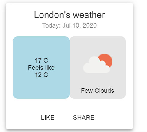
And we're done!! Here is how it looks.

You can keep adding to this, with other weather information as much as you want to. Only your creativity and a bit of CSS magic is required.
Thanks for reading! Bye :)


