Top 5 must-know CSS layout techniques
CSS is often seen as a bane by many web developers. It is not like your typical programming language and can be a bit hard to understand. However, you can learn a few common CSS layout techniques to make it all easier!
In this article, I will cover top 5 CSS layout techniques that beginners and even relatively more experienced developers should know when building their web layouts. There will be working code samples along the way, I promise :)
So, without further ado, let's get started!
CSS technique 1: How to center my content in a div
This is one of the most common and perplexing question developers have when they first start their journey into CSS. Once upon a time this was quite hard. When you only had text-align margins to center your content in a container. However, since the advent of CSS Flexbox and CSS Grid, this has got much easier!
So assuming you've some HTML markup like the following.
<div class="container">
  <div class="content">Centering this content</div>
</div>
You just need the following CSS to center everything contained in the container.
.container {
  display: grid;
  place-items: center;
  height: 100vh;
}
What does this do? Simply converts the container into a grid with just one item (our content). place-items is a shorthand property representing alignment in both horizontal and vertical axes. If it only has one value, the second value is also the same. So in this case we are actually setting it to center center.
Why is this useful to know? Because then we can align in one axis when we need. For instance, we can use start center to align the content horizontally only.
One gotcha here is to make sure to have an explicit height for the container, otherwise centering makes little sense. This could be height of the viewport (100vh) as we're doing here.
Here is a codepen showing this simple, yet powerful CSS layout technique in action.
See the Pen css-problem-center by Zoaib (@thisiszoaib) on CodePen.
CSS technique 2: How to layout my content in a row
By default, whenever you add a div to your HTML code, it is ordered from top to bottom in a column format. But almost always you've at some least elements in your design which are arranged in a row.
How do you handle such layouts? There are multiple ways you could do this, but the best way, in my opinion, is to use CSS Flexbox. Flexbox provides a lot of power and flexibility (pun intended) to arrange elements in one dimension - either row or column.
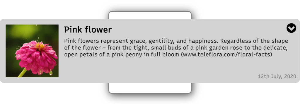
Let's suppose we want to build a card/list item view like the following.
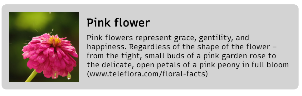
We'll need an HTML markup similar to the following.
<div class="card">
  <img
    class="image-box"
    src="https://source.unsplash.com/HThrGm87Fso/500x500"
  />
  <div class="description-box">
    <h2>Pink flower</h2>
    <p>
      Pink flowers represent grace, gentility, and happiness. Regardless of the
      shape of the flower – from the tight, small buds of a pink garden rose to
      the delicate, open petals of a pink peony in full bloom
      (www.teleflora.com/floral-facts)
    </p>
  </div>
</div>
To convert our "card" in the HTML above to a row layout, all we have to do is to add display: flex to our layout container which in this case, is the card CSS selector.
.card {
  display: flex;
  background: lightgray;
  padding: 16px;
  border-radius: 10px;
}
We also added a bit of styling to make the look more complete. By default, the direction of the flex container is set to row, so we don't have to do much else here. All our nested elements will now be arranged in a row.
But the powerful thing about Flexbox is how we can control the sizes of the elements in our row. One option when we just need a fixed size is simply to set the width explicitly. We want the image box in our case to be of fixed width, so we do exactly that here.
.image-box {
  width: 150px;
  height: 150px;
  margin-right: 16px;
}
Flexible widths in CSS flexbox
However, often we also want to make the widths flexible, so that they are allowed to grow and shrink. For that purpose, CSS flexbox provides three properties that we can set: flex-grow, flex-shrink and flex-basis.
A full explanation of these three properties is out of the scope of this post, but a quick overview is in order. So flex-basis is meant to be the starting width of your element. This can be in pixels, percentages or any unit valid in CSS. Flex-grow and flex-shrink are then meant to specify whether the element is allowed to expand or contract from that width when there is space to do so.
These three properties can be condensed into a more convenient flex property which is in the form of flex-grow flex-shrink flex-basis.
In our case, we just need the description box to expand to the given area, so we're just going to specify flex: 1 to it, which simply means we want the div to grow or shrink as it finds more space or doesn't find any space.
.description-box {
  flex: 1;
}
flex: 1 is another way of saying flex: 1 1 0 i.e flex-grow is 1, flex-shrink is 1 and flex-basis is 0. For more information the MDN docs are very helpful!
As a result, we have a decent looking view with our elements arranged in a row.
Check out a working codepen here.
See the Pen css-problem-row by Zoaib (@thisiszoaib) on CodePen.
Interested in knowing more about designing card views? Check out this simple weather card design and how I did it here!
CSS technique 3: How to give an absolute position to my element
Sometimes, there are tiny bits of information or elements that need to positioned very precisely somewhere and do not fit into the layout based design as we discussed above. Or we don't want such elements to be bound to the layout of the rest of the content and prefer to keep it separate.
In these cases, absolute positioning is one of the must know CSS layout techniques. By default, the position of all elements is set to static or in some cases to relative. Both of these work very well with elements which are a part of the flow of the content of our layout.
To give our elements an arbitrary position, we need to set the display property of the element to absolute. We can also set it to fixed, but that would mean our element will be positioned relative to the browser view (similar to how toolbars are made sticky e.g.).
Example for CSS absolute positioning
Let's look at an example in continuation of our previous example and add some absolutely positioned elements.
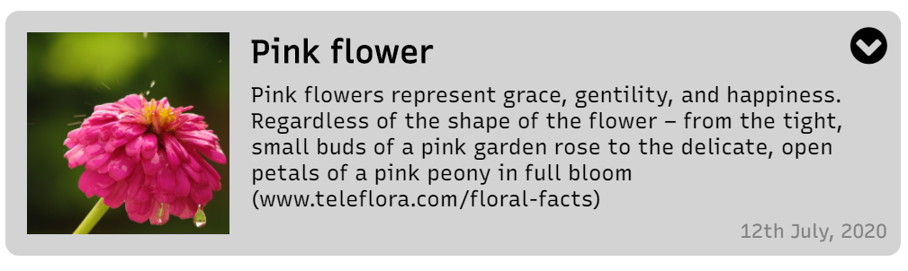
First question you need to ask when positioning absolutely is which container you're going to use as a reference point for the position. In other words, which container do you want as the parent. We need to set the position of the parent to relative or absolute. Otherwise, the absolute positioning will not work as intended and the element will be positioned relative to body content.
This is an important gotcha! If you don't set the parent position correctly, you won't be able position elements precisely
In our case, the card is the parent, so we're going to set it's position like so.
.card {
  display: flex;
  background: lightgray;
  padding: 16px;
  border-radius: 10px;
  position: relative; // Setting the position property
}
We also need to add our absolute positioned elements to the HTML markup. This can be anywhere within the card container.
<div class="card">
  ...
  <i class="fa fa-2x fa-chevron-circle-down more-icon" aria-hidden="true"></i>
  <span class="date">12th July, 2020</span>
</div>
Next, we need to set the position of our element to absolute and also specify the position itself. For this, we have four properties top, bottom, left and right. In practice, we just need two of these, one from each orientation, such as top left, bottom right etc.
So in our case, we set the dropdown icon and the date CSS selectors to the following.
.more-icon {
  position: absolute;
  right: 10px;
  top: 10px;
}

.date {
  position: absolute;
  bottom: 10px;
  right: 10px;
  color: gray;
  font-size: 0.9rem;
}
Nice touch to our card view, right? This can be used for giving the user a floating menu and it doesn't have to be part of our main row layout for the list item.
Here is the codepen, showing this in action.
See the Pen css-problem-arbitrary-position by Zoaib (@thisiszoaib) on CodePen.
CSS technique 4: How to overlap elements
As a quick follow up to the previous problem, many times we need to overlap elements in our layout. Think about popup dialogs, progress bars, spinners and similar elements. We can't really put them into our flexbox containers because they need to come on top of everything in the view. So this is one of the most useful CSS layout techniques for such elements!
The way we do this is to simply use absolute or fixed positioning in combination with the z-index CSS property.
Let's add a simple popup div overlapping our list view like the following.
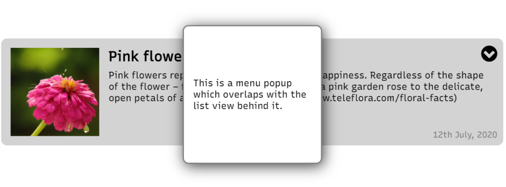
First, the very simple HTML markup. The div needs to be outside of any other container, if we want it to appear on all content on the screen.
<div class="popup">
  This is a menu popup which overlaps with the list view behind it.
</div>
Next we make it absolutely positioned, add the z-index and add some styling so it appears elevated. If you so require, you can set a left, right, top or bottom property as well.
.popup {
  position: absolute;
  padding: 16px;
  display: grid;
  place-items: center;
  width: 200px;
  height: 200px;
  border: 2px solid gray;
  border-radius: 10px;
  box-shadow: 3px 4px 23px 0px rgba(0, 0, 0, 0.75);
  background: white;
  z-index: 1000;
}
This popup will now appear on top of all elements with z-index less than 1000. For things like popups, we usually keep it at a high enough value so no other element is higher. So e.g. in our case, if we set our card's z-index to 1001, this would be the result.
Oops! The popup is no longer a popup anymore. You get the idea.
Here is the complete code for this.
See the Pen css-problem-overlap by Zoaib (@thisiszoaib) on CodePen.
CSS technique 5: How to fit an image in a specific size
Working with images in CSS can a bit frustrating. For instance, if you're designing a UI element which needs to have a consistent layout (e.g. a square image area) but the images that you get are of various dimensions, it is not going to look good at all. Often, we don't really know which dimensions our images are in, so we need some CSS layout techniques to handle this for us.
One of the ways to handle that (which I liked), is to not use an img element, but instead use a div with a background-image CSS property. This gives us the useful background-size property which, if set to cover gives us a nice container for our images and doesn't look bad.
However, it is not semantically correct, since an image should be represented by an img element. Fortunately, we have a nice little property for img elements as well.
Suppose we have two images in our case. The first you can see is a square as we want, so it'll appear fine if our img is also a square.

The next one will appear squashed however, since it is not a square and we're trying to force it into one.
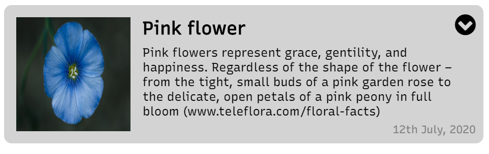
The solution? Just add a one-liner to our image CSS class like so.
.image-box {
  width: 150px;
  height: 150px;
  margin-right: 16px;
  object-fit: cover; // This does the trick!
}
You can also check out other options for the object-fit property, if they suit your needs more. Here is a useful link at MDN web docs with other CSS layout techniques for the img tag!
Check out the complete code below.
See the Pen css-problem-image by Zoaib (@thisiszoaib) on CodePen.
Conclusion
CSS can be challenging at times, but with some simple tricks you can make great layouts in no time. Don't be afraid of going back to the basics, if needed. Even experienced developers do so, all the time!
I hope this article helped you in gaining a bit of insight into how to make complex layouts with only HTML and CSS. It is by no means an exhaustive list. Just a collection of what I consider the most common layout issues you'll come across.
Thanks for reading!
Bye :)


