
Transform Your Angular Material Buttons with Custom Colors, Sizes, and Professional Styling
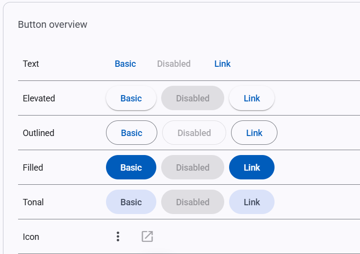
Angular Material provides a solid foundation for building modern web applications, but if you've been working with it for a while, you've probably noticed that the default button options can feel somewhat limited. While the four standard button types—filled, elevated, outlined, and text—work well for basic use cases, they don't always provide the flexibility needed for more sophisticated user interfaces.
The Problem with Default Angular Material Buttons
Out of the box, Angular Material buttons come with a fairly restrictive set of styling options. You get your primary color theme, and that's about it.
This limitation becomes apparent when you're trying to build interfaces that need:
- Clear visual hierarchy between different types of actions
- Error states for destructive operations
- Secondary actions that don't compete with primary buttons
- Compact sizing for dense interfaces or toolbars
- Modern styling that aligns with current design trends
I encountered this challenge recently while working on a forms designer project. The default button styling simply wasn't providing enough differentiation between various action types, and the sizes felt too large for the interface density I was aiming for.
A Systematic Approach to Button Customization
Rather than resorting to custom CSS hacks that might break with future Angular Material updates, I decided to work within the framework's design system. Angular Material v18 introduced an improved design token system that makes it much easier to extend existing components while maintaining consistency with the overall theming approach.
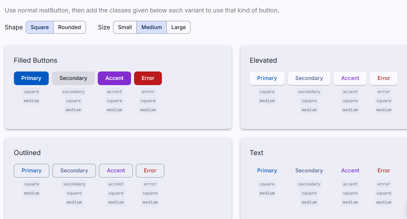
For my Angular Dashboard Template, I developed a comprehensive button extension system that includes:
Color Variants
- Accent buttons: For highlighting important secondary actions
- Secondary buttons: Subtle styling for actions that shouldn't dominate the interface
- Error buttons: Clear visual indication for destructive actions like delete operations
Size Options
- Compact variants: Smaller buttons that work better in dense interfaces
- Flexible sizing: Options that adapt well to different screen sizes and use cases
Enhanced Icon Buttons
- Colored icon buttons: Icon-only buttons that follow the same color system
- Consistent hover states: Proper interaction feedback across all variants
Implementation Strategy
The key to this approach is leveraging Angular Material's official theming system rather than fighting against it. By using CSS variables and design tokens, we can extend the existing components cleanly and maintainably.
Here's how the system works in practice (Angular Material 20 syntax):
<!-- Standard primary button -->
<button matButton="filled">Primary Action</button>

<!-- Accent variant -->
<button matButton="filled" class="accent">Accent Action</button>

<!-- Error state for destructive actions -->
<button matButton="filled" class="error">Delete Item</button>

<!-- Secondary action -->
<button matButton="outlined" class="secondary">Cancel</button>
The implementation uses Angular Material's mat-button-overrides and mat-icon-overrides mixins to properly target the design tokens for different button states. This ensures that:
- All customizations work seamlessly with Angular Material's theme switching
- Dark mode variants are automatically generated
- Hover and focus states are properly handled
- The styling remains consistent with Material Design principles
.accent {
  @include mat.button-overrides(
    (
      filled-container-color: var(--mat-sys-tertiary),
      filled-label-text-color: var(--mat-sys-on-tertiary),
      outlined-label-text-color: var(--mat-sys-tertiary),
      protected-label-text-color: var(--mat-sys-tertiary),
      text-label-text-color: var(--mat-sys-tertiary),
      text-state-layer-color: var(--mat-sys-tertiary),
      protected-state-layer-color: var(--mat-sys-tertiary),
      outlined-state-layer-color: var(--mat-sys-tertiary),
    )
  );
}
Technical Benefits
This approach offers several advantages over custom CSS solutions:
Maintainability: Since we're working within Angular Material's design system, updates to the framework are less likely to break our customizations.
Consistency: All button variants automatically inherit proper theming, spacing, and interaction behaviors.
Accessibility: The underlying Angular Material accessibility features remain intact.
Performance: No additional CSS overhead or specificity conflicts.
Theme Integration: Custom buttons work perfectly with theme switching and dark mode.
Real-World Applications
In practice, this extended button system makes it much easier to create professional-looking interfaces. For example:
- Form interfaces: Clear distinction between submit, cancel, and reset actions
- Data tables: Compact edit and delete buttons that don't overwhelm the content
- Toolbars: Small, focused action buttons that maximize available space
- Confirmation dialogs: Proper visual hierarchy for confirm/cancel scenarios
Getting Started
If you're interested in implementing this system in your own projects, I've created a detailed video tutorial that walks through the entire process, from setting up the custom theme to implementing all the button variants.
The complete implementation is also available as part of my Angular Dashboard Template, which includes this button system along with other Angular Material enhancements. The template has been updated to work with Angular 20 and includes all the code you need to start using these enhanced buttons immediately.
Looking Forward
This button enhancement is just one example of how Angular Material's design token system can be leveraged to create more flexible and professional-looking interfaces. The same principles can be applied to other components like form fields, cards, and navigation elements.
The goal isn't to replace Angular Material's design philosophy, but rather to extend it in ways that give developers more tools to create polished, user-friendly applications.
Have you run into similar limitations with Angular Material components? What enhancements would be most valuable for your projects? I'd love to hear about your experiences in the comments below.
Resources
- Video Tutorial: Watch the complete implementation walkthrough
- Angular Dashboard Template: Get the template with all button variants included
- Angular Material Design Tokens: Official documentation


