
Create Multi Select List with Angular CDK Selection Model
In a previous post, we created an Angular material list with infinite scroll. In this post, we're going to convert that into a Multi Select List with the Angular CDK Selection Model.
Video tutorial
Angular CDK Selection Model is a nice utility API included in the CDK package, that allows us to quickly add selection functionality to our apps.
Our final result will look something like below.
We can select any item on the list, the header shows us the items selected and we can also select all items and deselect all items. Selection Model makes all of this pretty quick!
So let's get started.
Check out the video above on my YouTube channel for a walkthrough of this tutorial. Otherwise, just continue below!
Setting up the app
Our starting point in this tutorial will be our existing list which we created in my previous post on infinite scrolling list.
So I'm assuming we have our project ready.
Next, we'll add an import for MatCheckboxModule, which we'll use for selection.
import { MatCheckboxModule } from '@angular/material/checkbox';

@NgModule({
  declarations: [AppComponent],
  imports: [
    ...
    MatCheckboxModule
  ],
Adding the checkbox to the list items
Next, let's go in our template and add the checkbox to our list items. We'll remove our matAvatar because we don't need it and it'll look weird with our checkbox. So we'll replace it with a mat-checkbox.
<mat-list-item *cdkVirtualFor="let item of listItems">
      <mat-checkbox mat-list-icon>
      </mat-checkbox>
      ...
    </mat-list-item>
  </mat-list>
To position this right, we'll add a directive called mat-list-icon. This is for showing an icon in a list but we can also use it to show anything on the left side of the list item content which is exactly where we need our checkbox.
Let's test this out now.
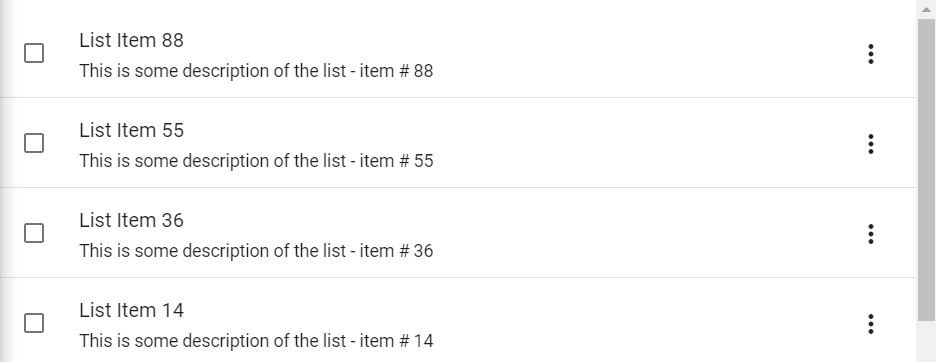
Great, the checkbox is in the correct position!
Creating a Selection Model
Next, let's go in our component and declare a variable called selection. This will be a new SelectionModel class.
The type here is any, but ideally we should have a type defined for our list item and use the same here!
selection = new SelectionModel<any>(true, []);
The Angular CDK Selection Model takes in two parameters. The first one is whether this will allow multi selection or not. We've set this to true, because we want multi selection.
The second one is the initial value for the selection, which we've kept as an empty array [].
Binding the Selection Model with the checkbox
Great, now let's bind this selectionModel to our checkbox. So first, we'll specify what should happen when the checkbox changes in the change event.
<mat-list>
  <mat-list-item *cdkVirtualFor="let item of listItems">
    <mat-checkbox
      mat-list-icon
      [checked]="selection.isSelected(item)"
      (change)="selection.toggle(item)"
    >
    </mat-checkbox>
    ...
  </mat-list-item>
</mat-list>
Here we're just going to call selection.toggle() and give our current item. Also, we've linked the checked attribute of the mat checkbox to whether the item is currently selected or not.
Simple enough right?
Adding a header to the list
Next, we'd like to have a master selection checkbox as well. For this we need a header. Let's create a new div above our list with the class header. Inside of this, we'll add a mat-checkbox and two spans.
One will be showing our total list items and the other one will be showing our selected items.
So we're going to use the selection.selected which gives us the array of currently selected items and use its length property.
<div class="header">
  <mat-checkbox></mat-checkbox>
  <span>Showing {{listItems.length}} items</span>
  <span class="selected-text" *ngIf="selection.selected.length">
    ({{selection.selected.length}} selected)</span
  >
</div>
Of course, we only want to show this when the selection is not empty so we'll keep an *ngIf with selection.selected.length - this will only show this span when we need it.
Before adding the checkbox functionality, let's quickly add some styling so it appears good.
.header {
  display: flex;
  justify-content: flex-start;
  align-items: center;
  padding: 20px;
  background: #6776ca;
  font-size: 1rem;
  color: white;

  > mat-checkbox {
    margin-right: 25px;
  }

  .selected-text {
    margin-left: 10px;
  }
}
This will have display: flex and align items center and a padding of 20px all around. We'll make the background color a bit light indigo and a color of white so that text pops out.
We've also added a style for the checkbox, giving a margin-right of 25px. Also. we'll add a selected-text class on our second span and a style with some margin on it so that we have some spacing.
Great, let's test all this out.
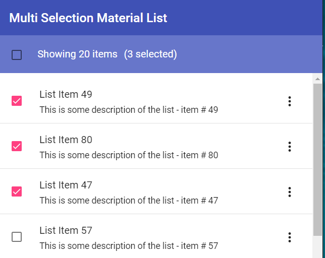
Ok, the header looks nice and when we select or deselect any of our items, it adds and removes from the selection model which is updated in our header as well!
But our master checkbox doesn't work as yet. Let's do that next.
Adding the master checkbox functionality
We'll add a change event handler to our master checkbox and give a new function called toggleMasterSelection().
Let's add this function in our component. Now toggling master selection requires us to check whether all our items are selected or not.
Let's create a getter called allSelected and the logic we can use here would be whether the selection.selected.length is equal to listItems.length. If it is, then we return true. Otherwise, it's false.
get allSelected(): boolean {
 return this.selection.selected.length === this.listItems.length
;
}
Great, let's now use this in our toggle function. So we'll check if allSelected is true. If it is, then we'll use the clear function in the selection model to clear out everything.
If not, then we need to select ALL items. We can do this by calling select and using the spread operator to add all the listitems to it.
toggleMasterSelection() {
    if (this.allSelected) {
      this.selection.clear();
    } else {
      this.selection.select(...this.listItems);
    }
}
Also, we need to set when the checkbox will be in checked state. For that, we'll again use the allSelected getter that we defined.
<mat-checkbox
  [checked]="allSelected"
  (change)="toggleMasterSelection()"
></mat-checkbox>
Great! Let's test this out.
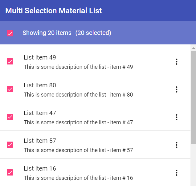
So now when we select all, we can see the header status updated and also all our items being selected automatically because we've bound them with our selection model.
Adding the indeterminate state to the checkbox
Just one last thing we need now. If you notice, when we select master checkbox and then deselect any of our items, the master checkbox becomes unselected as well. This is fine because it shows the user that all items are NOT selected.
But there is a better way to indicate some items are selected and that is the indeterminate state.
So let's set the indeterminate input of our checkbox. Now we want it to be indeterminate when selection.selected.length is not zero and also when allSelected is false. In other words, when some items are selected, but not all.
<mat-checkbox
  [checked]="allSelected"
  [indeterminate]="!!selection.selected.length && !allSelected"
  (change)="toggleMasterSelection()"
>
</mat-checkbox>
Great, so let's finally test this out.
So, yes now you can see that beautiful indeterminate state of the master checkbox when only some items are selected.
Conclusion
In this tutorial, we covered adding an easy, multi selection capability to an existing list with the help of Angular CDK Selection Model. You'll notice we used minimal code to get a fully functioning selection feature in the list and this is the benefit that using the SelectionModel API brings us!
The complete code for this tutorial can be found here.
Thanks for reading! Bye :)


