Create a responsive navbar in Angular using Flex Layout
Designing a navbar (or a toolbar) is easy for one screen size, but to make a truly responsive navbar, Flex Layout provides us with some neat tricks we can use!
If you are developing a web application, chances are you will need a navbar to display links to different sections of the site. That is all quite easy if your users are only on the desktop. But in today's world, more of your users will be on the mobile or even tablets.
In this article, I will show you how to create a truly responsive navbar using Angular Material components and Flex Layout. Here is the final result:

The final result
Setting up the project
Let's first quickly set up a new Angular project with Angular Material and Flex Layout by running these commands.
ng new responsive-toolbar
ng add @angular/material
npm install --save @angular/flex-layout
Next, let's add our module dependencies to the app.module.ts:
@NgModule({
  declarations: [AppComponent],
  imports: [
    BrowserModule,
    BrowserAnimationsModule,
    MatToolbarModule,
    FlexLayoutModule,
    MatMenuModule,
    MatButtonModule,
    MatIconModule,
    MatDividerModule,
  ],
  providers: [],
  bootstrap: [AppComponent],
})
export class AppModule {}
Setting up a new component
Once the project is set up, let's start adding all the parts we need. First, let's start by adding a new component to contain our responsive navbar.
ng generate component responsive-toolbar
We'll be coming back to this in a bit. We want our menu items to be defined in code for re-use in both the buttons and drop-down menu. So let's also add a model for the menu item.
It's strictly not needed, but with typescript it is always better to specify types - it gives a bit of structure to new developers and makes the development process easier by code hints in templates.
ng generate interface menu-item
export interface MenuItem {
  label: string;
  icon: string;
}
A basic responsive navbar
Let's now add the menu items to our component. Here's the responsive toolbar component:
@Component({
  selector: "app-responsive-toolbar",
  templateUrl: "./responsive-toolbar.component.html",
  styleUrls: ["./responsive-toolbar.component.scss"],
})
export class ResponsiveToolbarComponent implements OnInit {
  menuItems: MenuItem[] = [
    {
      label: "Sign Up",
      icon: "login",
    },
    {
      label: "About",
      icon: "help",
    },
    {
      label: "Pricing",
      icon: "attach_money",
    },
    {
      label: "Docs",
      icon: "notes",
    },
    {
      label: "Showcase",
      icon: "slideshow",
    },
    {
      label: "Blog",
      icon: "rss_feed",
    },
  ];

  constructor() {}

  ngOnInit(): void {}
}
We're just declaring the menu items array here. Let's look at the template where the actual magic happens.
<mat-toolbar fxLayout="row" color="primary">
  <span fxFlex>Responsive Toolbar Demo</span>
  <button mat-button *ngFor="let item of menuItems" fxHide.xs>
    <mat-icon class="mr">{{item.icon}}</mat-icon>
    {{item.label}}
  </button>
  <button mat-icon-button [matMenuTriggerFor]="dropMenu" fxHide fxShow.xs>
    <mat-icon>more_vert</mat-icon>
  </button>
  <mat-menu #dropMenu="matMenu">
    <ng-container *ngFor="let item of menuItems">
      <button mat-menu-item>
        <mat-icon class="mr">{{item.icon}}</mat-icon>
        {{item.label}}
      </button>
      <mat-divider></mat-divider>
    </ng-container>
  </mat-menu>
</mat-toolbar>
Let's go through what we've done in the template.
- We have added a material toolbar component which contains everything
- We're using Flex Layout's
fxLayoutdirective to specify that everything in the container will be laid out in a row - We've an
*ngFordirective which we're using to create a button with icon for each menu item. - We've a "more" button icon at the end of the row, which triggers a material dropdown menu containing our items.
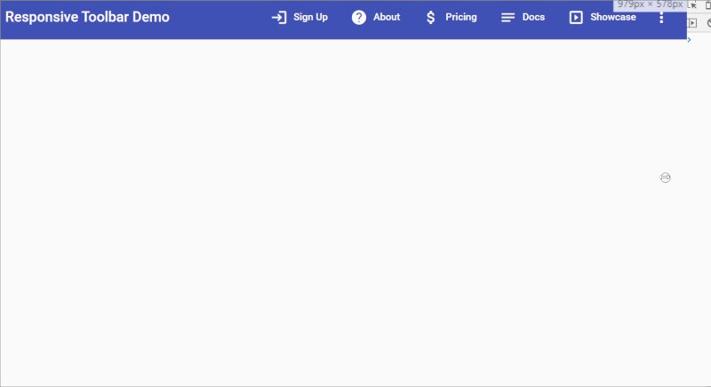
All this is fine and well. But where is the responsive code? If you look closely, we also have fxHide and fxShow in some places. Basically, Flex Layout provides us with these directives and their breakpoint suffixes (such as xs, sm etc.) so that we can hide or show different elements at different screen sizes.
The behavior that we want is that the menu buttons should show when on desktop, but on mobile sizes, should all compress into a 'more' button and a dropdown menu.
For the top buttons, the default is they'll be shown (we don't need to specify), so we use fxHide.xs to hide them when on mobile. Conversely, the default for the dropdown menu would be hidden, so we use fxHide. But then we use fxShow.xs to show the icon button at mobile sizes.
Here is how it looks!
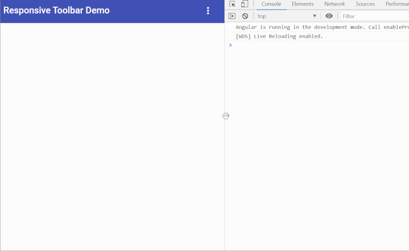
Typical responsive toolbar
We want more control
This is all looking good. However, as you can see in the animation above, our buttons compress into each other when we begin approaching the mobile size. It would be nice if we can have more control over which buttons to show on this intermediary size (e.g. tablet).
For that to happen though, we need to add a bit more code. This will allow us to specify which menu item to show in the buttons menu or dropdown menu and on which screen sizes.
Let's modify our menu item interface to accommodate this flexibility.
export interface MenuItem {
  label: string;
  icon: string;
  showOnMobile: boolean;
  showOnTablet: boolean;
  showOnDesktop: boolean;
}
We added three boolean types to specify for each item, where it should show and should not show.
Next, let's update out menu items array.
menuItems: MenuItem[] = [
    {
      label: 'Sign Up',
      icon: 'login',
      showOnMobile: true,
      showOnTablet: true,
      showOnDesktop: true
    },
    {
      label: 'About',
      icon: 'help',
      showOnMobile: false,
      showOnTablet: true,
      showOnDesktop: true
    },
    {
      label: 'Pricing',
      icon: 'attach_money',
      showOnMobile: false,
      showOnTablet: false,
      showOnDesktop: true
    },
    {
      label: 'Docs',
      icon: 'notes',
      showOnMobile: false,
      showOnTablet: true,
      showOnDesktop: true
    },
    {
      label: 'Showcase',
      icon: 'slideshow',
      showOnMobile: false,
      showOnTablet: false,
      showOnDesktop: true
    },
    {
      label: 'Blog',
      icon: 'rss_feed',
      showOnMobile: false,
      showOnTablet: false,
      showOnDesktop: false
    },
  ];
As you can see, we're specifying the "Sign-up" menu item to appear at the top on all breakpoints. In other words, it is getting the highest priority. These items will be useful for most used features in any app. Having prominent links to such features helps our users and ultimately the product in the end!
On the other hand, notice how the "Blog" section is never shown at the top. This is just an example, but you can have unimportant sections in your apps, which you need for completeness, but users don't really need that much. So this section will just appear in the menu as an additional option when users want (or go looking for it).
Making the navbar truly responsive
The only thing that's left now is to actually add handling for this data to our templates. Here is how the template looks now.
<mat-toolbar fxLayout="row" color="primary">
  <span fxFlex>Responsive Toolbar Demo</span>
  <button
    mat-button
    *ngFor="let item of menuItems"
    [fxShow]="item.showOnDesktop"
    [fxShow.xs]="item.showOnMobile"
    [fxShow.sm]="item.showOnTablet"
  >
    <mat-icon class="mr">{{item.icon}}</mat-icon>
    {{item.label}}
  </button>
  <ng-container>
    <button mat-icon-button [matMenuTriggerFor]="dropMenu">
      <mat-icon>more_vert</mat-icon>
    </button>
    <mat-menu #dropMenu="matMenu">
      <ng-container *ngFor="let item of menuItems">
        <div
          [fxShow]="!item.showOnDesktop"
          [fxShow.sm]="!item.showOnTablet"
          [fxShow.xs]="!item.showOnMobile"
        >
          <button mat-menu-item>
            <mat-icon class="mr">{{item.icon}}</mat-icon>
            {{item.label}}
          </button>
          <mat-divider></mat-divider>
        </div>
      </ng-container>
    </mat-menu>
  </ng-container>
</mat-toolbar>
The only difference in this and the previous version is in how we're now using the new properties we defined for each item and binding them with Flex Layout's directives.
For the top buttons, we're binding each item's fxShow directive to the corresponding breakpoint.
As an example, fxShow.xs binds to item.showOnMobile - in other words, we're telling the button for that item to only show on top on mobile, when it has showOnMobile to true. The logic is similar for desktop and tablet.
For the dropdown menu items, notice we're not hiding or showing the "more" icon anymore, but instead adding more fine control over individual menu items.
This is the power of Flex Layout, where you can add a directive to virtually anything in the DOM. Check out another article on how to build a responsive card grid using flex layout here!
For the dropdown menu items though, we use a reverse logic.
As an example, fxShow.xs binds to !item.showOnMobile - in other words, we're telling the button for that item to only show in the dropdown on mobile, when it has showOnMobile to false. This is when the button would be hidden on top.
The result of these changes will be the menu items moving in and out of the top buttons and the dropdown menu as the screen size changes. When they are hidden on the top, they get added to the dropdown and reverse!
And we're done! Here is the result - a truly responsive, flexible navbar (or toolbar) ready for you to use in your projects.
Our final, flexible "responsive" toolbar
Next steps
As you might have noticed, I didn't add any real navigation functionality to the menu items. To do that, you could add a route property and use it navigate to the same for each item. And if you want to build upon this, you could also add nesting to the menu according to your needs.
The sky is the limit in this case!
Thanks for reading! If you have any comments, or want to share a better way to achieve this, fire up a comment below.
The final code for this tutorial can be found here.
Bye! :)


