Create a multi select chips component with Angular Material
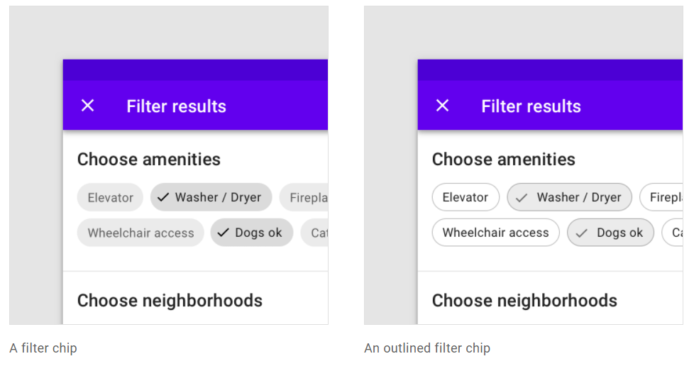
I was going through the material design spec document the other day and came across the ever so versatile material chips. They're versatile in the sense that you can use them as action buttons, filter buttons or selection buttons depending on your use case. For instance, I wanted to use them as multi select chips.
However, upon going through the Angular Material Components library I was a bit disappointed to see that apart from some basic functions, the chips component was not really useful. A glaring issue was that it could not be used as a form control as other material components can.
So, I went about building my own version of a multi-select chips component on top of the existing material chips. This would not only appear similar but also allow easy integration with Angular forms (both reactive and template).
In this article, I'm going to explain how I did this. Our final result will be a multi-select chips component as shown below.
Let's get started!
Setting up our project
To set up our project, we're going to run the following Angular CLI commands on the terminal.
ng new mutli-select-chips
ng add @angular/material
The above commands just create a new project and add the angular material library to it. We can then import the modules we require in our app.module.ts file.
@NgModule({
  declarations: [AppComponent],
  imports: [
    BrowserModule,
    BrowserAnimationsModule,
    MatChipsModule,
    MatIconModule,
    MatToolbarModule,
    MatDividerModule,
    ReactiveFormsModule,
    MatButtonModule,
    MatCheckboxModule,
  ],
  providers: [],
  bootstrap: [AppComponent],
})
We need these material components in one way or the other in our project.
Creating a basic material chips component
Next, let's create a new component with the following command.
ng generate component chips-multi-select
This component will have our options array as the input, so that we can display them as chips. So let's go ahead and add it to the component file.
@Input() options: string[] = [];
Let's add a material chips component now to its template file.
<mat-chip-list>
  <mat-chip *ngFor="let option of options" [value]="option">
    {{option}}
  </mat-chip>
</mat-chip-list>
Nothing fancy here. Just an *ngFor directive looping through the options and display the same as a chip inside the material chips list.
Adding multi select behavior
Now let's add the multiple selection behavior to the chips. The first modification we'll do is pretty simple and involves adding two directives like below.
<mat-chip-list selectable multiple> ... </mat-chip-list>
This will allow us to set multiple chips in the list as selected. How do we select the chips though? We can do so by adding the selected directive to the specific chip in our template.
But we want this to happen when the user clicks the chip, so we'll do this dynamically instead. Let's make the following changes to our component.
<mat-chip-list selectable multiple>
  <mat-chip
    #c="matChip"
    *ngFor="let option of options"
    [value]="option"
    (click)="toggleSelection(c)"
  >
    {{option}}
  </mat-chip>
</mat-chip-list>
For each our our chips, we've simply given a template variable to the matChip export so we can pass this to our click event handler. The click handler uses the toggleSelected() function of the chip class and this causes the state of the chip to change.
toggleSelection(chip: MatChip) {
   chip.toggleSelected();
}
Visually, the selected chip uses the primary color of your theme to stand out from the normal unselected chips.
To test the component, we're just passing in a simple options array that could be used for an ecommerce store. This is how it looks now.

Great! This is enough for our needs probably, but let's add an icon to the selected chips as well, so it's more similar to the example I showed above.
<mat-chip #c="matChip" *ngFor="let option of options" [value]="option">
  <mat-icon *ngIf="c.selected">check</mat-icon>
  {{option}}
</mat-chip>
To do this, we've added an *ngIf directive to the icon and are checking for the selected property of the material chip through its template reference c. To smooth out the visual look, we'll also add a bit of styling to the component's style file.
mat-icon {
  height: 20px;
  width: 20px;
  font-size: 20px;
  margin-right: 5px;
}
Nothing much, just added some spacing and adjusted the size of the icon. The result?

Neat! Now that we have our appearance and a part of the functionality all set, let's move on to converting this into a proper Angular Form Control.
Converting it into a form control
Though our multi-select chips component looks and behaves well in terms of selection, but there doesn't seem to be any clean way to get the selected values when working with Angular forms (both template-driven and reactive).
Fortunately, Angular provides us an interface called ControlValueAccessor which will help us convert our component into a proper Angular Form Control. When we're done, you can integrate the chips component with your other components using Angular forms and the [formControl] directive.
Implementing the ControlValueAccessor interface
Let's go ahead and implement the interface in our custom chips component.
export class ChipsMultiSelectComponent implements OnInit, ControlValueAccessor {
  writeValue(value: string[]): void {}

  registerOnChange(fn: any): void {}

  registerOnTouched(fn: any): void {}

  setDisabledState?(isDisabled: boolean): void {}
}
When you use your IDE's feature to add the required functions for the interface, you'll get four empty functions in your component. Let's go through each of them a bit to get a better understanding and add the required functionality for our component.
registerOnChange and registerOnTouched
Let's first get these two functions out of the way since, they'll be pretty short (or empty).
So both of these are used to register change event handlers when the form control is initialized. These handlers can then be called when needed from within the component to specify when the component's value has changed or when the component has been touched (e.g. when an input control loses focus).
For our case, we don't need to specify if our multi-select chips component was touched, so we'll leave this function empty. For registering the change event, we're simply going to save the function passed in as parameter in our component as onChange.
onChange!: (value: string[]) => void;

registerOnChange(fn: any): void {
    this.onChange = fn;
}

propagateChange(value: string[]) {
    if (this.onChange) {
      this.onChange(value);
    }
}
Note the addition of an extra function propagateChange. This is just so we can check for the onChange function as to whether it does exist, before calling it to propagate the value.
We'll soon be using this function to send our value changes. But before that, let's go through the writeValue function quickly.
writeValue
The writeValue function is triggered in two cases:
- When your Form Control is given an initial value on declaration
- When you use the setValue or patchValue function of the control to give it a value
In our case, it'll simply have an array of strings (representing the selected option values) in the parameter. We'll save this value for future reference and also update our chips list to show this selection.
@ViewChild(MatChipList)
 chipList!: MatChipList;
value: string[] = [];

writeValue(value: string[]): void {
    // When form value set when chips list initialized
    if (this.chipList && value) {
      this.selectChips(value);
    } else if (value) {
      // When chips not initialized
      this.value = value;
    }
}

selectChips(value: string[]) {
    this.chipList.chips.forEach((chip) => chip.deselect());

    const chipsToSelect = this.chipList.chips.filter((c) =>
      value.includes(c.value)
    );

    chipsToSelect.forEach((chip) => chip.select());
  }
That's a bit of code, so let's go through it step by step.
First, we've added variable to store the value and are setting that value in the function. This is only needed when the chips list has not initialized yet on the UI. Because once it's initialized, we simply set its selection, which in turn updates the value as well (because of the chips change event handler - more on that in the next section).
Secondly, in case the chips list has initialized, we go ahead and select the chips and for that purpose I've added a selectChips function. It uses the MatChip API calls to first deselect all and then select the specific chips according to the array value passed in.
To get the MatChipList component, we're using the ViewChild decorator.
Adding the chip selection change event
We've now specified how the value coming in should be used to update the UI. Now we need to specify the reverse i.e. how to send the selection changes and new value back. For this, we'll implement the MatChipList selection change event. This event fires off when any of the chips within the list are selected or deselected which is perfect for our needs.
Since, the material chips list is not initialized when ngOnInit is called, we'll need to add this event handler to ngAfterViewInit.
ngAfterViewInit() {
    this.chipList.chipSelectionChanges
      .pipe(
        untilDestroyed(this),
        map((event) => event.source))
      .subscribe((chip) => {
        if (chip.selected) {
          this.value = [...this.value, chip.value];
        } else {
          this.value = this.value.filter((o) => o !== chip.value);
        }

        this.propagateChange(this.value);
      });
  }
Looks a bit complex, but it isn't! It's just using RxJS to simplify our flow. Here's what we're doing in short.
- Getting the source chip for the current selection change
- If the chip is selected, adding it to the current value of the component (using the spread operator to ensure immutability)
- If the chip has been deselected, using the filter function on the values to remove it from the values (again ensuring immutability)
- Propagating the changed value using our already created function!
Not that difficult now, was it? :)
Lastly, we just need to add one statement before we set this up to select the chips based on the current value. This is done to cover the case when we're sending the initial value of the form control. Since the chips list has not been initialized on the UI at that point, we need to do it in ngAfterViewInit as well.
ngAfterViewInit() {
    this.selectChips(this.value);

    this.chipList.chipSelectionChanges...
    // Rest of code
}
Since we're subscribing to an event here we also need to unsubscribe to prevent memory leaks.
I'm using my favorite way here: the @ngneat/until-destroy library. You can use your own way, as long as it works :)
setDisabledState
At this point, you should've a functioning form control to work with. This last function can be used to add handling for when the control is disabled or not. In our case, we'll simply save a variable for this and use it to set the disabled state of the material chips list. Also, we'll disable the click handler so the user can't change anything.
disabled = false;

setDisabledState?(isDisabled: boolean): void {
    this.disabled = isDisabled;
}

toggleSelection(chip: MatChip) {
    if (!this.disabled) chip.toggleSelected();
}
Telling Angular about our new form control
The last step in converting our component to a form control is to properly inform Angular about it, so that the framework can recognize that it is indeed an Angular Form Control. We do this by specifying the component in the providers array as an NG_VALUE_ACCESSOR.
@Component({
  selector: 'app-chips-multi-select',
  templateUrl: './chips-multi-select.component.html',
  styleUrls: ['./chips-multi-select.component.scss'],
  providers: [
    {
      provide: NG_VALUE_ACCESSOR,
      useExisting: ChipsMultiSelectComponent,
      multi: true,
    },
  ],
})
There is no space here to go into much detail about Angular's Dependency Injection and the concepts associated with it. But here it's enough to say that we're essentially registering our component as a form control, so Angular knows where to look for when binding with the Forms API.
If you'd like to go more in depth into Angular's DI system, check out the official documentation here.
Testing it all out!
Ok, that's too much code for my liking! Let's test it all out to see everything in action.
I've added our custom multi-select chips component to our app's base component along with a checkbox to toggle disability, a button to see whether we can set the form control's value correctly and a value section to show the current value of the control.
<div class="content">
  <app-chips-multi-select [options]="options" [formControl]="chipsControl">
  </app-chips-multi-select>

  <mat-divider></mat-divider>

  <h3>Value: {{chipsControlValue$ | async}}</h3>

  <mat-divider></mat-divider>

  <mat-checkbox [formControl]="disabledControl">Disabled</mat-checkbox>

  <mat-divider></mat-divider>

  <button mat-raised-button (click)="setChipsValue()">Patch Value</button>
</div>
Since this is fairly routine, I'm going to skip the component code here. If you want to go through it, you can refer to the complete code for the app in this github repo.
If you test out now, you'll see all our form control functions and multiple selection on the chips working as it should!
Conclusion
Phew, that was a lot, especially converting our component to a form control was a bit tedious. However, this will save us a lot of time in the long run when we need to re-use our component as a form control at several places in our app!
So the effort is definitely worth it, isn't it?
I hope this sheds some light over how to create custom form controls in Angular and if you create some components, do comment and share your experiences and challenges.
If you liked this, you might also like my recent post on Angular Material tabs and Lazy loading routes.
The complete code for this tutorial can be found in this github repository.
Thanks for reading!
Bye 😊


