Angular Material Dark Mode in 3 steps
A dark mode is a must-have little feature for your Angular web application. It is easier on the eyes and less draining for your smartphone battery.
With Angular Material 3, this is simpler than ever. You no longer need separate light and dark theme definitions, a .darkMode class, or special overlay hacks. Material now emits colors with the CSS light-dark() function, and you switch themes by setting the color-scheme property.
Here is how you can add light, dark, and system theme support to your Angular Material app in three simple steps.
Want the easiest path to a custom Material 3 theme with dark mode built in? Use Material Theme Builder to generate your colors, typography, and theme CSS, then drop it into your Angular app.
The end result will be a minimal Angular Material app with a theme menu for light, dark, and system preferences. Here is how it will look like.

Let's get started!
Step 1: Add a Material 3 theme with color-scheme
Angular Material 3 themes are created with the mat.theme() mixin. When you include it, Material generates system tokens like --mat-sys-primary and --mat-sys-background using the CSS light-dark() function.
Those tokens only switch between light and dark values when color-scheme is set. So the first step is to put both on html in your styles.scss:
@use "@angular/material" as mat;

html {
  color-scheme: light dark;

  @include mat.theme(
    (
      color: mat.$azure-palette,
      typography: Roboto,
      density: 0,
    )
  );
}

body {
  margin: 0;
  font-family: Roboto, "Helvetica Neue", sans-serif;
  background-color: var(--mat-sys-background);
  color: var(--mat-sys-on-background);
}
A few important bits:
color-scheme: light darktells the browser to follow the user's system preference by default.mat.theme()creates one theme that works for both light and dark, with nodefine-light-theme/define-dark-themepair needed.--mat-sys-*tokens are what you use for your own page styles, so custom UI follows the same theme as Material components.
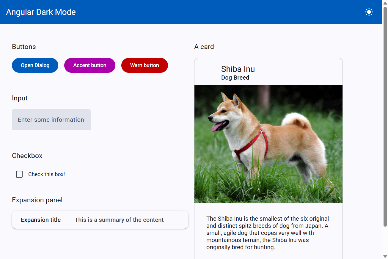
I've just added some basic Material components so we can see the effect of the theme changes. Feel free to customize as you want (the code link is available at the end of this post). In light mode, it looks like this.
With color-scheme: light dark, your app already respects the OS light/dark setting. Next, we'll let users override that choice.
Step 2: Add light, dark, and system switching
We need a way for users to choose light, dark, or system at runtime. A small theme service plus a menu in the toolbar keeps this clean.
First, create a ThemeService that stores the preference and applies it by setting color-scheme on the document:
import { Injectable, computed, effect, signal } from '@angular/core';

export type ThemeMode = 'light' | 'dark' | 'system';

export interface AppTheme {
  name: ThemeMode;
  icon: string;
}

const STORAGE_KEY = 'angular-dark-mode-theme';

@Injectable({
  providedIn: 'root',
})
export class ThemeService {
  private readonly appTheme = signal<ThemeMode>(this.readStoredTheme());

  private readonly themes: AppTheme[] = [
    { name: 'light', icon: 'light_mode' },
    { name: 'dark', icon: 'dark_mode' },
    { name: 'system', icon: 'desktop_windows' },
  ];

  readonly selectedTheme = computed(() =>
    this.themes.find((theme) => theme.name === this.appTheme())
  );

  constructor() {
    effect(() => {
      const theme = this.appTheme();
      const colorScheme = theme === 'system' ? 'light dark' : theme;

      document.documentElement.style.setProperty('color-scheme', colorScheme);
      localStorage.setItem(STORAGE_KEY, theme);
    });
  }

  getThemes(): AppTheme[] {
    return this.themes;
  }

  setTheme(theme: ThemeMode): void {
    this.appTheme.set(theme);
  }

  private readStoredTheme(): ThemeMode {
    const stored = localStorage.getItem(STORAGE_KEY);

    if (stored === 'light' || stored === 'dark' || stored === 'system') {
      return stored;
    }

    return 'system';
  }
}
The key line is setting color-scheme on document.documentElement (<html>):
light→ force the light tokensdark→ force the dark tokenslight dark→ follow the system preference
We also persist the choice in localStorage so it survives a refresh.
Then wire up a simple menu in the toolbar:
<mat-toolbar>
  Angular Dark Mode
  <div class="flex-stretch"></div>
  <button mat-icon-button [matMenuTriggerFor]="themeMenu">
    <mat-icon>{{ themeService.selectedTheme()?.icon }}</mat-icon>
  </button>
  <mat-menu #themeMenu="matMenu">
    @for (theme of themeService.getThemes(); track theme.name) {
      <button mat-menu-item (click)="themeService.setTheme(theme.name)">
        <mat-icon>{{ theme.icon }}</mat-icon>
        <span>{{ theme.name | titlecase }}</span>
      </button>
    }
  </mat-menu>
</mat-toolbar>
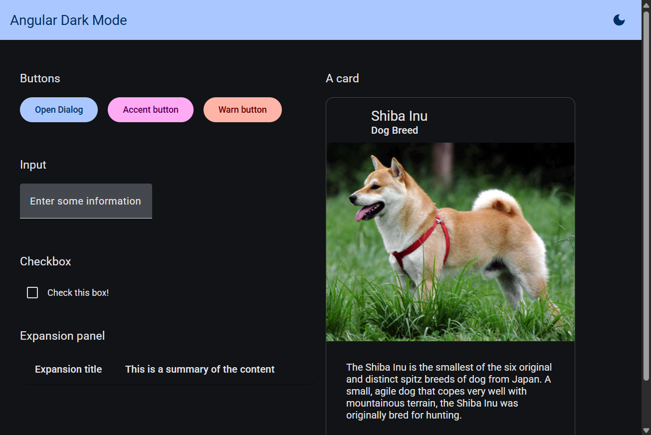
Great! If you test this now, the toolbar menu should switch the whole app between light, dark, and system. Material components and your --mat-sys-* page styles update together. Here is the same app in dark mode.
Step 3: Confirm overlays just work
In the old Material theming approach, dialogs and menus lived in an overlay container outside your root component. That meant you had to manually add a dark-mode class to OverlayContainer.
With Material 3 and color-scheme, that extra step is gone.
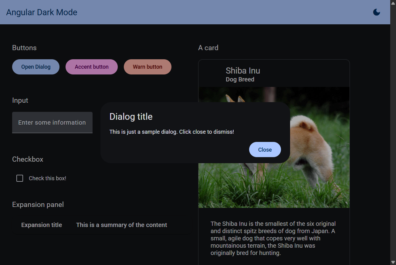
Because theme colors are CSS variables driven by color-scheme on the document, overlays inherit the same light/dark values automatically. Open a Material dialog after switching themes; it should already match.
To prove it in the demo app, we open a simple dialog from a button:
showDialog(): void {
  this.dialog.open(SampleDialogComponent, {
    width: '500px',
  });
}
No OverlayContainer injection. No class toggling on the overlay. Just set color-scheme, and Material follows.
Conclusion
And that's it! We now have proper dark mode for an Angular Material 3 app, including light, dark, and system preferences, with much less code than the old custom-theme approach.
To recap:
- Use one
mat.theme()and setcolor-scheme: light dark - Toggle themes by updating
color-scheme(light,dark, orlight dark) - Skip overlay hacks; dialogs and menus follow automatically
If you want to go further, you can customize brand colors, typography, and density, or generate a full theme visually with Material Theme Builder.
The complete code for the sample app is available on this GitHub repository.
Updated for Angular 22 and Angular Material 3. The old dual-theme /
.darkMode/OverlayContainerapproach has been replaced withmat.theme(),light-dark(), andcolor-scheme.
Thanks for reading!
Bye :)


