Angular Animations: Create a card flip animation
Animations add a nice touch to any application, if they're used in suitable places and not overdone. But when you're developing games, they are an absolute must!
Recently, I created a card memory game in Angular. I wanted to see how we can go about making a game and thought it would be something different from the usual enterprise apps built in the popular framework. Well, it was fun!
In this article, I'm going to explain how I created a card component used in the game which flips to reveal the front side when you tap it. We're going to learn a bit about 3D in CSS coupled with angular animations so we can get the following desired effect!
Our final result
Cool, right? Let's start by creating our card component.
Creating our card component
To create a component, we first need an app. You can use your own Angular app or create a completely new one using ng new app-name.
Then, let's create a new component called GameCardComponent using the following command.
ng generate component game-card
It is a best practice in Angular to define your interfaces, so let's go ahead and define our card interface.
export interface CardData {
  imageId: string;
  state: "default" | "flipped" | "matched";
}
Very simple! The interface contains an imageId, which represents the id of the Unsplash image we'll be loading on the front face of the card. And the state - which represents the current state of the card.
Notice how the state can have multiple values. Declaring the type in this way allows our IDE to give us helpful hints when we're about to assign values to them in code. This makes the development experience much better!
Lastly, the states here will correspond to our angular animation states as well. This will allow us to transition from one state to another when we tap on the card.
Making a 3D card UI with images
But for all of that to work, we first need to define a structure in HTML to house the game card. By definition, our card has to have a front and a back side.
How do we accommodate this in HTML? By using divs for both sides contained in a parent div.
<div class="card" (click)="cardClicked()">
  <div class="face back">
    <img src="assets/card-back.jpg" />
  </div>
  <div class="face front">
    <img [src]="'https://source.unsplash.com/' + data.imageId + '/200x300'" />
  </div>
</div>
The divs contain an img element inside. The back side has a graphic stored in my assets folder. You can use any graphic you want as the back side of the card.
The front side uses the Unsplash API to fetch the image with the Id specified in our data.
The tricky part is in the CSS, where we add some 3D magic to it.
:host {
  display: block;
  perspective: 600px;
}

.card {
  box-shadow: 10px 10px 43px -18px rgba(0, 0, 0, 0.75);
  border-radius: 5px;
  height: 300px;
  width: 200px;
  cursor: pointer;
  position: relative;
  transform-style: preserve-3d;
}

.face {
  display: block;
  position: absolute;
  width: 100%;
  height: 100%;
  border-radius: inherit;
  backface-visibility: hidden;

  > img {
    width: 100%;
    height: 100%;
    object-fit: cover;
    border-radius: inherit;
  }
}

.front {
  transform: rotateY(180deg);
}
This looks like a lot, so let's go through it carefully.
First, we convert our card to a 3D card. This we accomplish by applying a perspective property to our host selector. And we also apply a special CSS property called transform-style: preserve-3d to our card div. Both of these, when combined give all our nested elements a 3D look to them!
Second, we spice up our card a bit by introducing some box shadows and a border radius to give us those nice rounded borders. Other properties are fairly standard, so I'll not cover them in detail!
Third, we need to style the face, front and the back sections. The face is basically used to give an absolute positioning to our sections, so that they overlap each other. Then, in 3D space, we apply rotation transform of 180 degrees to the front section so that it is effectively hidden from our view initially.
Lastly, we need to add the backface-visibility: hidden property to our card faces, so that when any is rotated away from us to show its back, it is hidden from our view (and the other side is shown instead).
Phew! That was a lot. But the good thing is we have the card UI all setup with 3D perspective. All we need to do now is to apply a rotation transform to the card div, so that our whole setup rotates to show the two faces of the card.
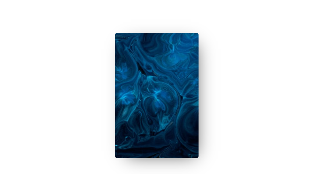
The 3D card with the back face showing
Testing it out!
To test out whether the flipping card works, we can utilize Chrome's Developer Tools (F12 on Windows) by applying different degrees of rotation to our card div. Just ng serve the app and add a transform of rotateY to the card div. Then, use the up and down keys on your keyboard or your mouse wheel to change the values. The card should rotate and show its two faces like a real card should!
Testing out the 3D card setup by rotating in Developer tools
Nice! In the next section, we'll apply these transformations using the Angular Animations API and in the process link them with our card states.
Introducing the Angular Animations API
At this point, we've our 3D card setup working and just need to add animations to it. The Angular Animations API provides us with the tools to animate any element. The three building blocks are trigger, state and transition.
While a detailed explanation is out of the scope of this post, a brief overview will be good and is as follows.
A trigger represents the definition of an animation in Angular and contains a set of states and the transitions between them. It is defined as a string and can be bound to any element in the UI.
A state is a set of properties similar to CSS style properties which should be applied to the element when the state is active. We specify the state when setting the trigger for an element in the template file. We can also change this state dynamically as we'll see in a bit!
A transition specifies the animation that should occur when the state changes. This can include the timing, the easing function etc.
Let's go ahead and define a trigger for our card flip animation in the game card component file.
@Component({
  selector: 'app-game-card',
  templateUrl: './game-card.component.html',
  styleUrls: ['./game-card.component.scss'],
  animations: [
    trigger('cardFlip', [
      state('default', style({
        transform: 'none'
      })),
      state('flipped', style({
        transform: 'rotateY(180deg)'
      })),
      transition('default => flipped', [
        animate('400ms')
      ]),
      transition('flipped => default', [
        animate('200ms')
      ])
    ])
  ]
})
We define the animation triggers we need in the component decorator. It is an array of triggers. Our trigger is called cardFlip and contains two states corresponding to our card state - default and flipped.
The default state contains no transformation. The flipped state contains a transform to rotate the card on the Y axis by 180 degrees.
The transitions tell us the time the animation should take from each state to the other. Here we've kept the flip to front animation to be of 400ms and back to 200ms.
Simple enough? Now let's see how we can link this animation with our card in the template.
<div class="card" (click)="cardClicked()" [@cardFlip]="data.state"></div>
Since we need to apply the styles in the state to our card div, we just add the cardFlip trigger to the same. Our state however will change at runtime, so we specify data.state instead of a static value. This will ensure that the animation will trigger as soon as our state changes.
Adding user interaction to trigger animations
Finally, with our animation states setup, we can add handling for the card tap event. This is as simple as binding to the click event on our card div like the following.
<div class="card" (click)="cardClicked()" [@cardFlip]="data.state"></div>
Then, adding the code for it in our component.
export class GameCardComponent implements OnInit {
  data: CardData = {
    imageId: "pDGNBK9A0sk",
    state: "default",
  };

  cardClicked() {
    if (this.data.state === "default") {
      this.data.state = "flipped";
    } else {
      this.data.state = "default";
    }
  }
}
As a result, we now have a great looking 3D card which can be flipped when you tap or click on it!
A 3D card which can be flipped
Conclusion
You must be thinking now, what next?
Well, this was just a part (the more difficult part, I guess) of the card memory game. We can now extend this component and include it in a larger game app involving cards!
I show you exactly how in the following post, including how to integrate the game card component into the larger app and build the game logic!
Also, if you'd like the complete code for this simple card component, you can find it here.
Hope you've learned something new, as I did when building this up. Happy coding. Bye :)
Support
You may also like...


🔥New Products
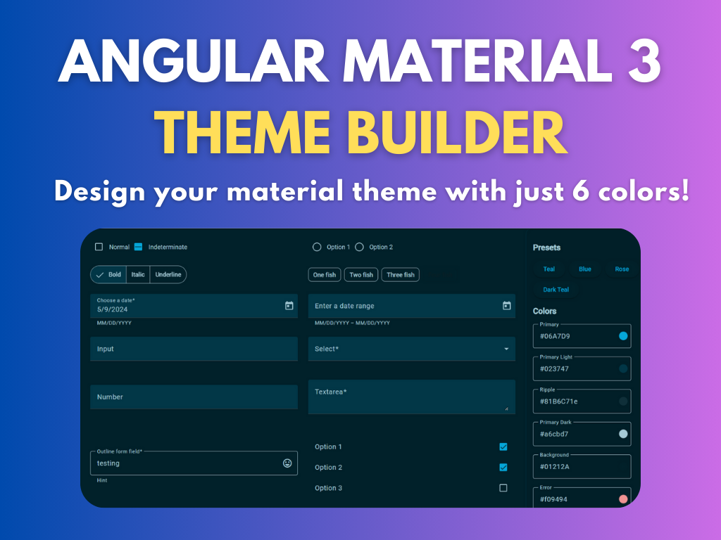
Easy, Dynamic Angular Material Theming!