Truncate multiple line text in Angular like a pro
Truncation is a common problem when developing user interfaces with varying lengths of text. While truncating a single line of text is easy through good old CSS, how to truncate multiple line text can be a challenge!
In this article, I'll go through two ways to achieve multi-line truncation in Angular. While the first part will be mostly CSS and can be migrated to other frameworks or simple websites, the second one is only applicable to Angular projects.
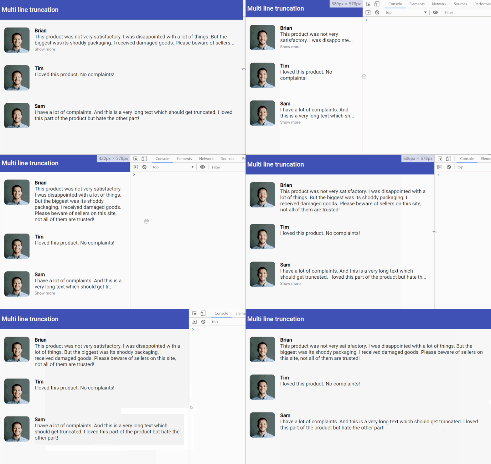
Here is what we're going to build by the end of the tutorial.

What do we mean by truncation
Just to be clear, truncation means cutting off a part of the text so that it fits in a specific area on our layout and does not affect our overall design, unless when the user wants to see more of it. This is usually accompanied by an "ellipsis" at the end to show to the user there is more text there.
In many cases, you'll also want to include a "Show more" link or button at the end of the truncated text to allow the user to display the complete text, if he/she's interested in the same.
Where is this useful? Some typical examples are a reviews list, a profiles list, product list with descriptions or just about any list where you need to make sure the text fits in a specific area/box and you know you'll receive different text lengths. It is a good way to give users a bit of summary of the information, but also allowing to go in detail if needed.
Let's start by looking at how to go about this with CSS.
Truncate multiple line text through CSS tricks
Unfortunately there is no standard, simple way to truncate multiple line text using pure CSS. At least, not till the time this post was written. But there have been several tricks proposed and used by the dev community.
From a reading of all though, the simplest one seems to be to use a webkit CSS property called -webkit-line-clamp. This appears odd since it looks like a vendor specific one - but oddly has good cross browser support. So in the absence of any other option, we're going to use this for the time being.
Setting up our project
To set up our project, we created a new Angular app, added Angular Material to use the toolbar and also included the Angular Flex Layout library to speed up our layout building.
Then, we created a new component called review-css with the following template (review-css.component.html).
<div fxLayout="row" class="card-back" fxLayoutGap="16px">
  <div fxFlex="80px">
    <img
      src="https://firebasestorage.googleapis.com/v0/b/web-tuts-611b3.appspot.com/o/profile.jpg?alt=media&token=12d87a30-0b38-4bff-abc8-cad745e4dd05"
    />
  </div>
  <div class="review-text">
    <h4>Brian</h4>
    <p class="line-clamp">
      This product was not very satisfactory. I was disappointed with a lot of
      things. But the biggest was its shoddy packaging. I received damaged
      goods. Please beware of sellers on this site, not all of them are trusted!
    </p>
  </div>
</div>
In this template, we're creating a Flex Layout row, with the a photo on the left and the review text for our review box on the right. To truncate the description text at the bottom, we've used the following CSS.
.line-clamp {
  display: -webkit-box;
  -webkit-line-clamp: 2;
  overflow: hidden;
  -webkit-box-orient: vertical;
}
As I said above, not very pretty in code. Note, the -webkit-line-clamp property is used to specify the lines we want to truncate to. In our case, we're truncating to two lines.
This results in quite a good looking truncation for our purposes, though! So our users will probably never care :)

CSS only truncation
Adding the 'Read More' link
This looks good till now, but we also want to provide a way for the user to read the complete text. Let's introduce a new variable in our component called showMore and use it to reveal the complete text. We add the following to the review-css.component.html file right below the description text.
<span class="more" *ngIf="!showMore" (click)="showMore = true">Show more</span>
We also make the line-clamp CSS class only applicable when showMore is not enabled using the ngClass directive in Angular.
<p [ngClass]="{ 'line-clamp': !showMore }">
  This product was not very satisfactory. I was disappointed with a lot of
  things. But the biggest was its shoddy packaging. I received damaged goods.
  Please beware of sellers on this site, not all of them are trusted!
</p>
This gives us what we want! A truncated text area which can be revealed when the user needs it to.

Show more link
Cool!
If you're a keen observer though, you'll notice this still has a problem. The "Show more" button always shows up, even if the text is short and fits in the same, with no truncation required. Unfortunately, though, there is no real solution to this.
Which takes us to our next way to truncate multiple line text and that is through Javascript!
Truncate multiple line text with Angular ngx-ellipsis
Having exhausted our CSS based methods, the only option left is to explore Javascript based solutions to our problem. Fortunately for us, there are already multiple Angular libraries available that achieve this.
I'm going to use ngx-ellipsis, which seems to be perfect for our purposes. It is simple to use and also responsive. In other words, the the text truncation will adjust itself when the screen size changes. Pretty neat!
Want to know more about responsive layouts and how to do it in Angular? See here how to build a responsive card grid using Flex Layout!
To use it, we simply install it through the command and import in our project.
npm install ngx-ellipsis --save
@NgModule({
  imports: [
    BrowserModule,
    BrowserAnimationsModule,
    FormsModule,
    MatToolbarModule,
    FlexLayoutModule,
    EllipsisModule,
  ],
  declarations: [AppComponent, ReviewCssComponent, ReviewJsComponent],
  bootstrap: [AppComponent],
})
export class AppModule {}
Then, we create a new component called review-js, use almost the same layout code and just modify the review description like this.
<p ellipsis [ngClass]="{ 'line-clamp': !showMore }">This product was not very satisfactory. I was disappointed with a lot of things. But the biggest was its shoddy packaging. I received damaged goods. Please beware of sellers on this site, not all of them are trusted!</p>
We've just added the ellipsis directive to our piece of text. For it to work though, we also have to provide it an explicit height (in any units). The library will then figure out how many lines fit in that area. So we just set the height in our line-clamp selector.
.line-clamp {
  height: 2.4rem;
}
And voila! We have a nice looking text truncated to two lines.

Multiple line truncation using ngx-ellipsis
Conditional show more button
BUT we're still not done yet! Remember the "Show more" button and that we had to show it only when the text is large enough to need truncation? We can do that here by using the ellipsis-change event of the library. This event is fired whenever the library recalculates the truncation. If no truncation is required, it sends an event parameter of null.
So we just introduce a simple showMoreButton variable in our component and then set it based on the output of this event.
truncated(index: number) {
    this.showMoreButton = index === null;
}
And also update the template to add the event and the "Show more" button.
<p
  #ellipsisRef
  ellipsis
  (ellipsis-change)="truncated($event)"
  [ngClass]="{ 'line-clamp': !showMore }"
>
  This product was not very satisfactory. I was disappointed with a lot of
  things. But the biggest was its shoddy packaging. I received damaged goods.
  Please beware of sellers on this site, not all of them are trusted!
</p>
<span class="more" *ngIf="!showMoreButton" (click)="showComplete()"
  >Show more</span
>
Now the button only shows up, when the text is actually truncated. Beat that, CSS!

No truncation, no 'Show more' link

Same text truncated due to screen width, so "Show more" appears!
Remove truncation from multiple line text
One last bit left is to remove the clamping. With CSS we simply used the ngClass directive and conditionally enabled or disabled the class for line clamping. Here we're doing the same, but why is it not working?
The reason is the ngx-ellipsis library needs to recalculate the truncation to update the text. So we add the following piece of code in the function to show the complete text.
@ViewChild(EllipsisDirective) ellipsisRef: EllipsisDirective;

showComplete() {
    if (this.ellipsisRef) {
      this.showMore = true;
      this.cd.detectChanges();
      this.ellipsisRef.applyEllipsis();
    }
}
Three things are happening here. We've added a ViewChild decorator here to grab the ngx-ellipsis directive from the template. Then we set our showMore variable to true, which disables the height we've set. Then we also have to call Angular Change Detection to make sure the template is updated before we ask ngx-ellipsis to update itself.
That's a wrap, folks!
Woah, that was some work. But all's well that ends well! We have a pretty nice looking, functional review component which allows multiple line truncation. Here is what a list with this component looks like with varying lengths of text.

I hope this helps someone, somewhere who's grappling with this seemingly simple challenge.
The code for this can be found in this stackblitz project.
Thanks for reading! Bye :)


